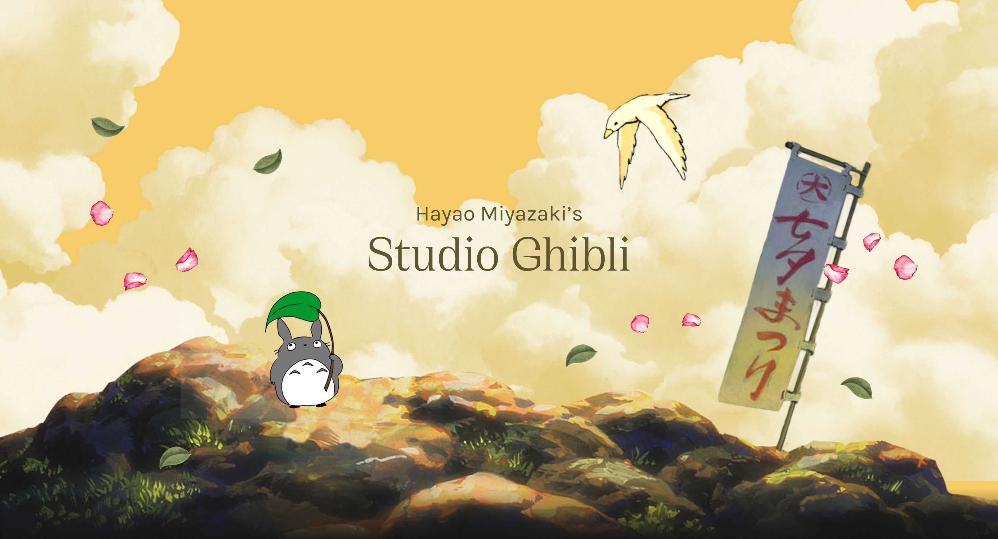
Hayao Miyazaki’s
Studio Ghibli
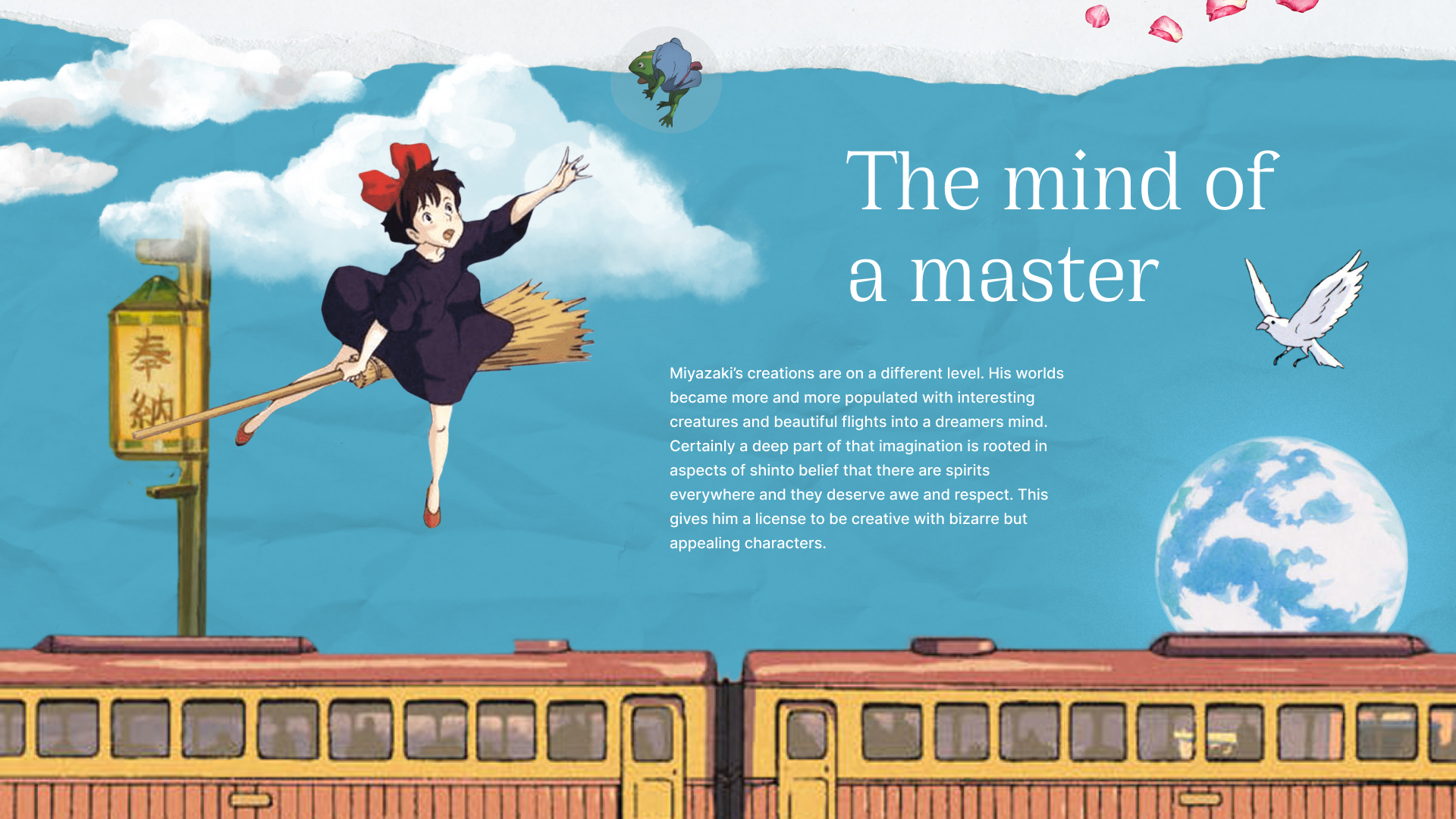
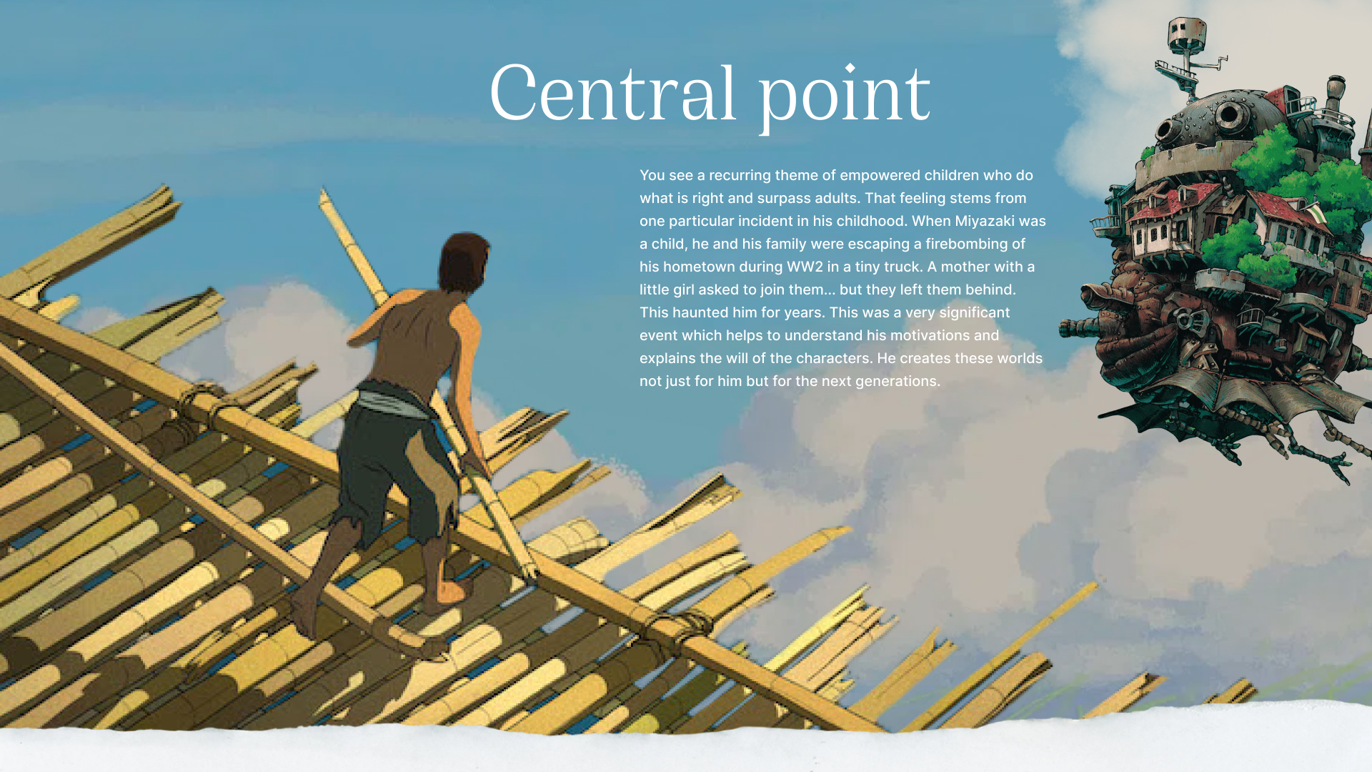
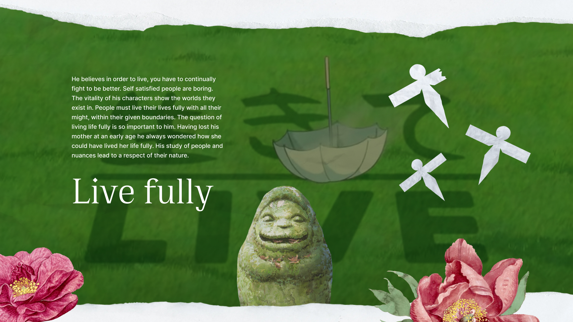
Hayao Miyazaki has a simple message in all of his films: live life to the fullest. This personal project is an exploration of what is so unique about his work, and what really fascinates me, is digging, layer by layer, down into the very driving force behind his incredible body of work. I used snippets from his films to create collages or my own interpretation of sceneries. As a Studio Ghibli fan the beautiful visuals and his inspiring story was the perfect combination to create a micro site dedicated to his craft.
Role : Art Direction, UI / UX, Prototyping
Tools : Figma, Photoshop
Role : Art Direction, UI / UX, Prototyping
Tools : Figma, Photoshop
Collecting assets and design development -
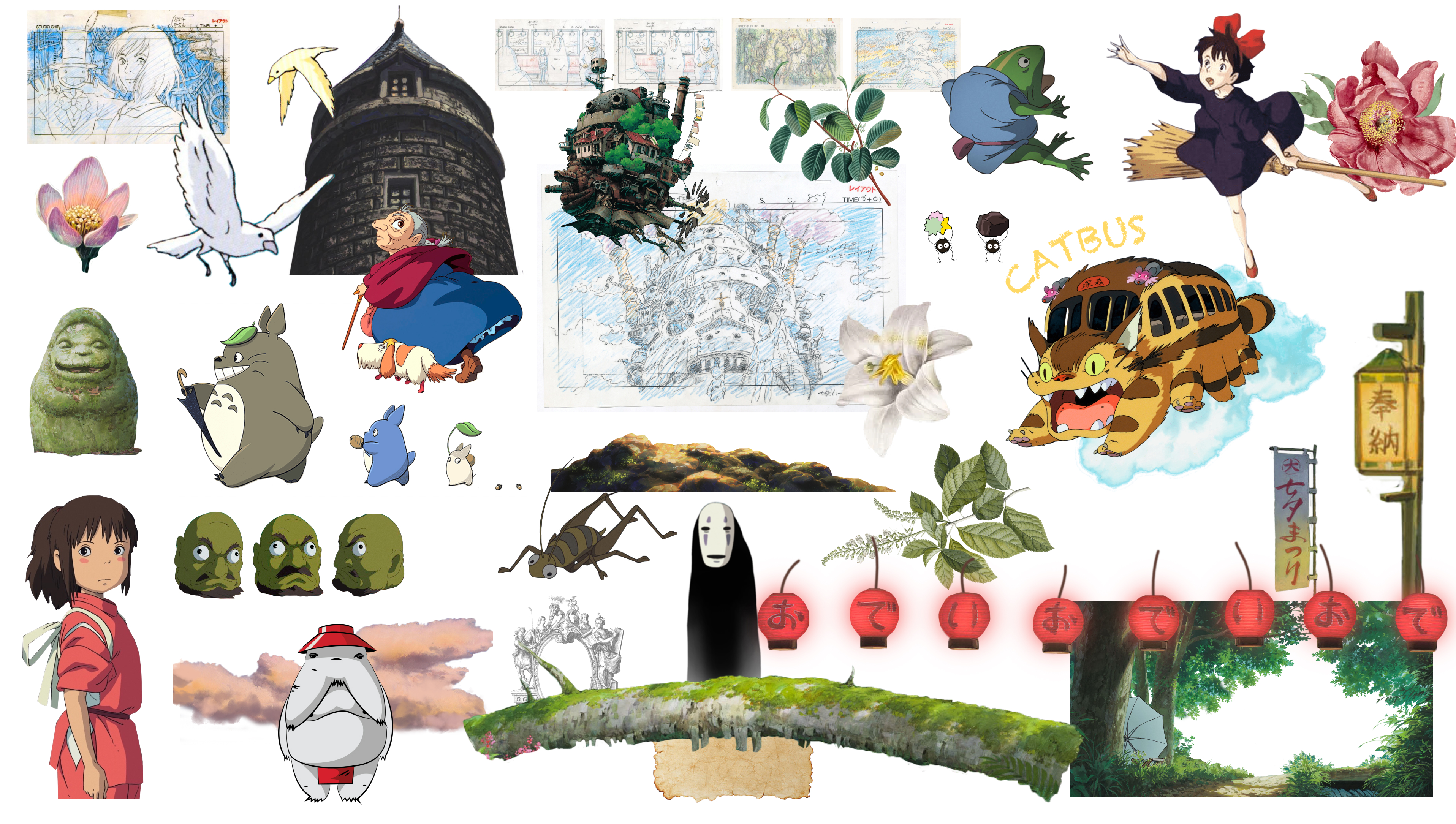
Visual Aesthetics : I incorporated the distinctive art style of Studio Ghibli. Using hand-drawn illustrations, watercolor textures, and soft pastel colors to evoke the enchanting world of Miyazaki's films. I chose a whimsical and elegant font that complements the artistic style while ensuring readability.
The content is organized into sections dedicated to different aspects of Studio Ghibli's work, such as films, characters, and behind-the-scenes insights. Using storytelling techniques to create a narrative flow throughout the microsite and guiding users through Miyazaki's creative journey.

Using parallax scrolling : The page creates an illusion of depth and movement by allowing different layers of content to move at different speeds as the user scrolls down or up the page. By using this effect I wanted to provide a visually engaging and immersive user experience.
I wanted to showcase Miyazaki's artwork, concept sketches, and illustrations in a dedicated gallery section. This allows users to zoom in for a closer look at the intricate details of the artwork.
By creating an artistic microsite dedicated to Hayao Miyazaki and Studio Ghibli I wanted visitors to be immersed in the enchanting world of Ghibli films while offering an intuitive and visually captivating user experience. It should celebrate the artistry and storytelling that have made Miyazaki's work beloved by audiences around the world.
Studio Ghibli’s online archive with a large number of stills from the movies are made available to download for free here.
Five things I learned from Studio Ghibli films as a designer
- Tell a story, and make it flow - Induce curiosity, create the setting and introduce the characters, and finally take the user along on an adventure.
- Show your human side - let your product be your user’s friend not just a tool.
- Give attention to every small detail - Studio Ghibli movies are so amazingly engaging since Hayao Miyazaki pays attention to every detail of the character including reactions and emotions towards simple every day things.
- Keep it simple - an example of this is Instagram, with its clear focus on photos and the camera
- Anything goes - I tend to overthink especially in the beginning of my design process. Pour out all your creative ideas before hitting the software. Go crazy with creativity, ANYTHING GOES.
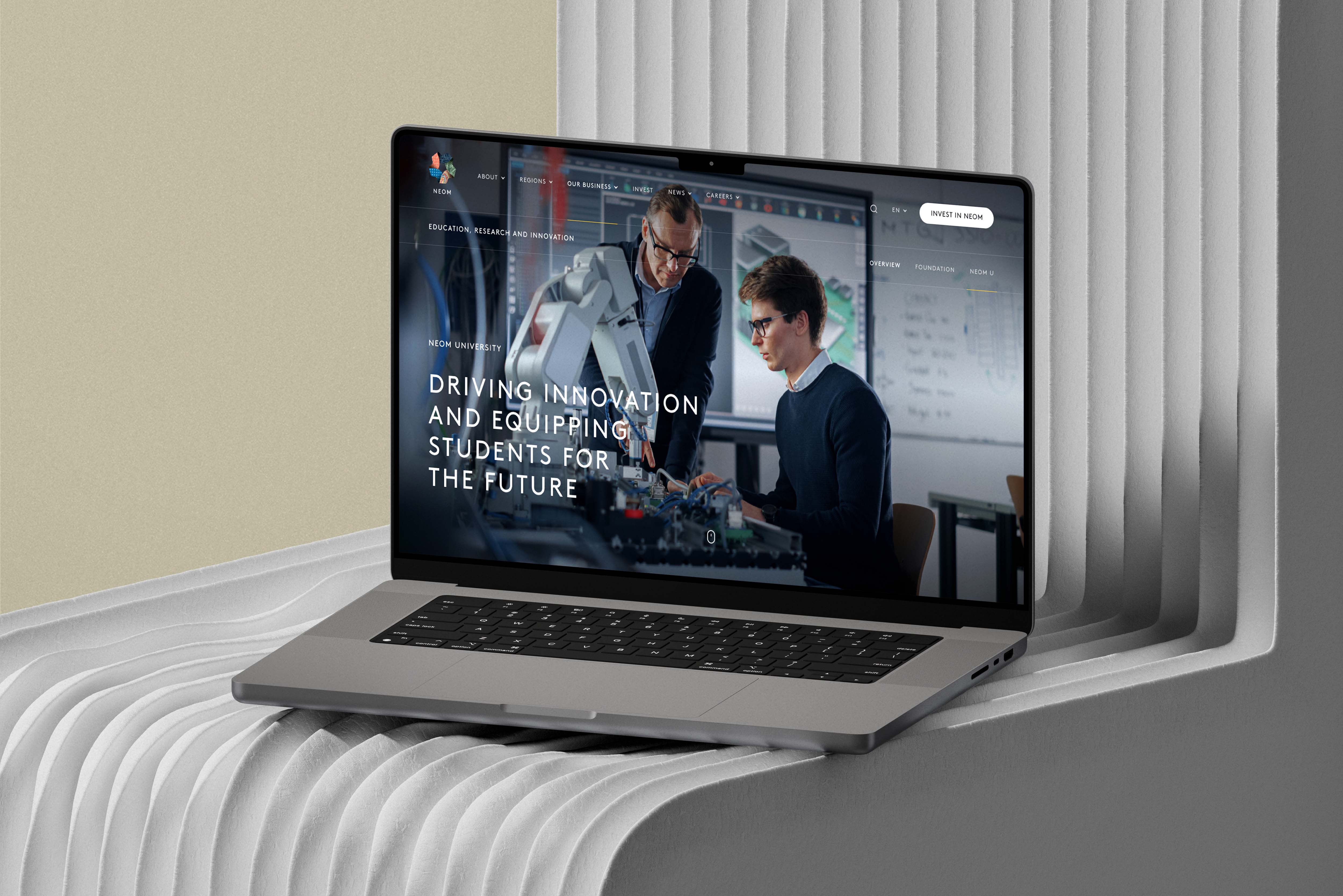
NEOM Education -
The Land of the Future
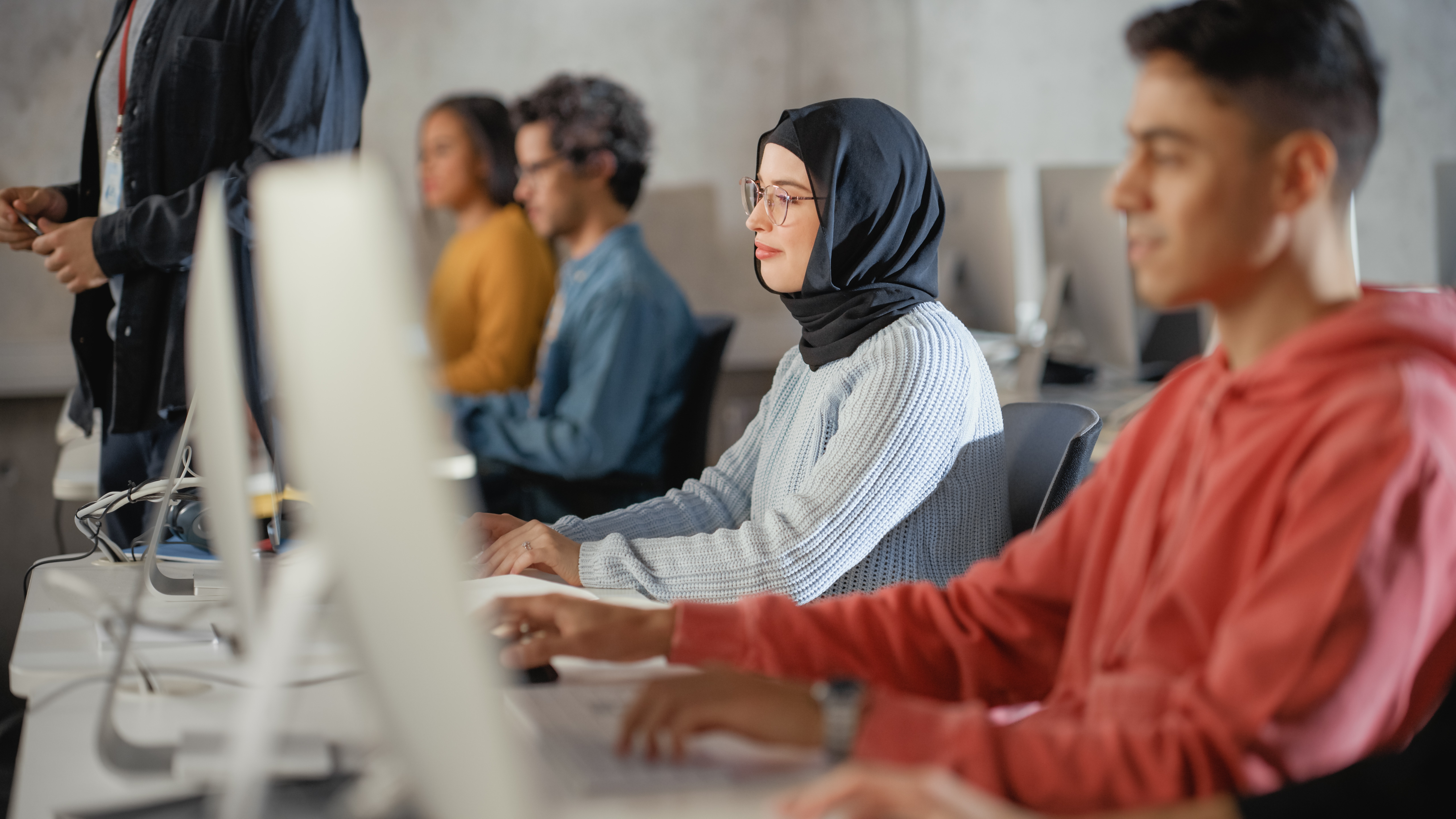
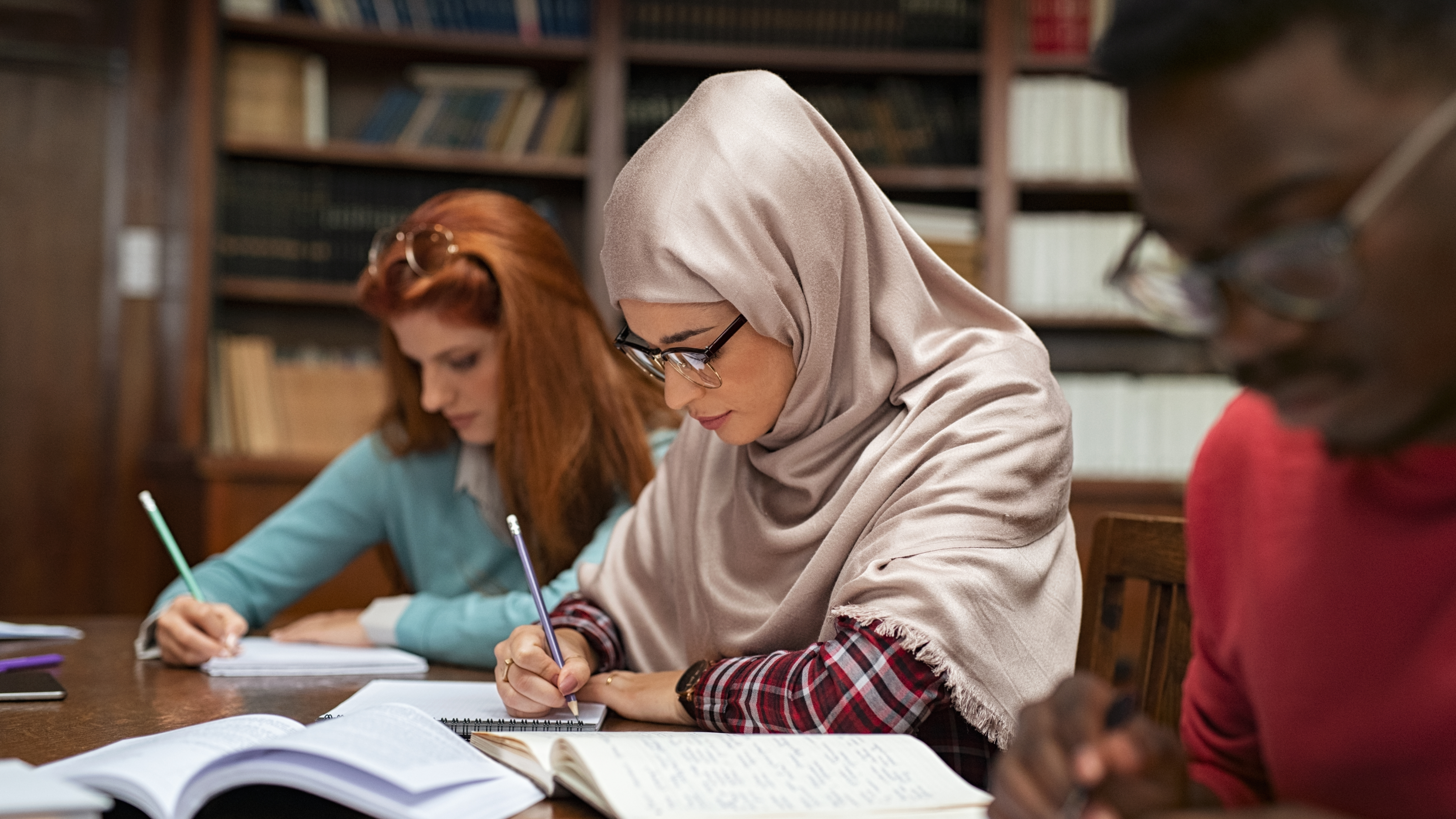
Neom is a new urban area planned by the Kingdom of Saudi Arabia to be built in its northwestern province. At MediaMonks, we developed a number of web pages in both desktop and mobile for Neom while keeping consistency through a design system. As Art Director my role included overseeing UI and UX as well as asset selection for the pages.
Role : UX/UI and Art Direction, accessibility
Tools : Figma, Photoshop
Role : UX/UI and Art Direction, accessibility
Tools : Figma, Photoshop
Who is NEOM?
Neom is the land of the future, a place meant to solve the challenges of tomorrow. An iconic, world-class destination, blending natural and developed landscapes, and offering unique human-centric experiences for residents and visitors alike. It is a well-being and biotech ecosystem, where it’s culture is about learning by doing, combining knowledge, creativity, and critical thinking with the latest technology and a digital mindset.
Comprising of multiple regions, NEOM aims to build cognitive cities, from the mountains to inspirational valleys by redefining the concept of urban development. They aim to reduce infrastructure footprint, creating never-before-seen efficiencies in city functions. To tackle the challenges facing humanity in urban life today and shine a light on alternative ways to live.
Comprising of multiple regions, NEOM aims to build cognitive cities, from the mountains to inspirational valleys by redefining the concept of urban development. They aim to reduce infrastructure footprint, creating never-before-seen efficiencies in city functions. To tackle the challenges facing humanity in urban life today and shine a light on alternative ways to live.
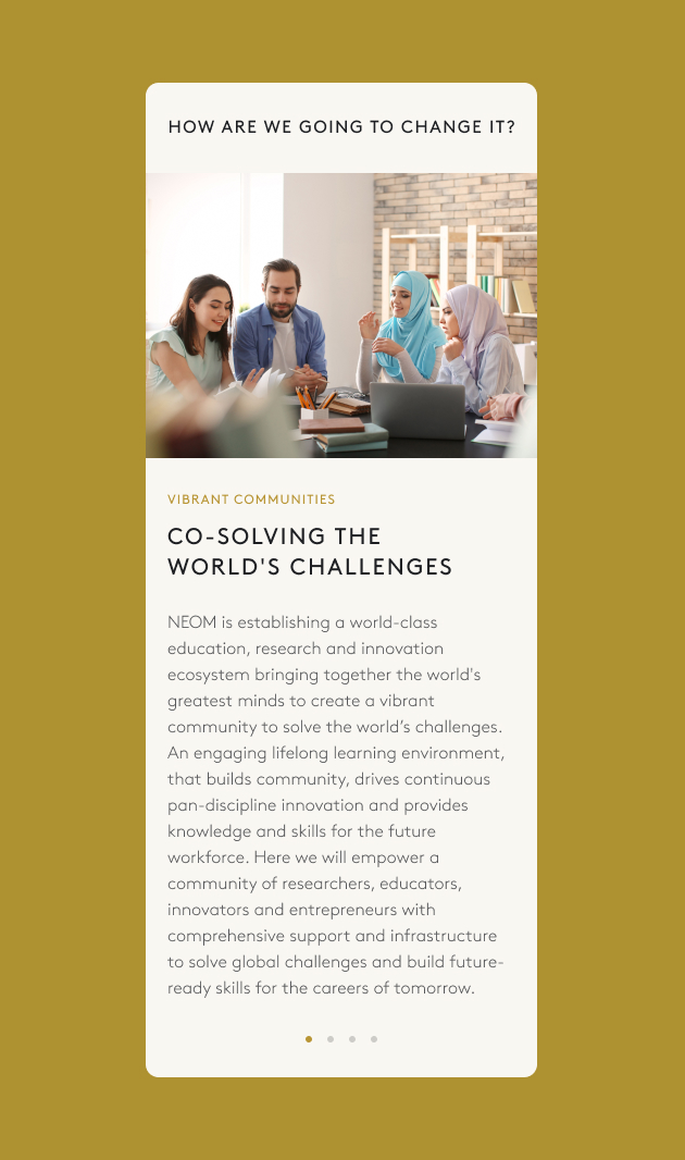
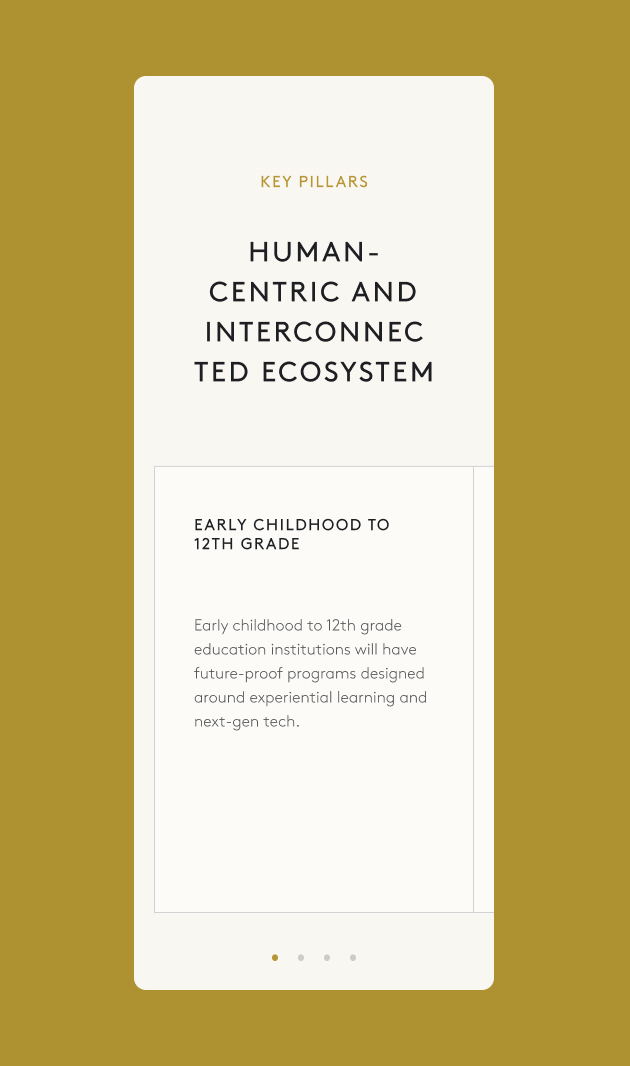
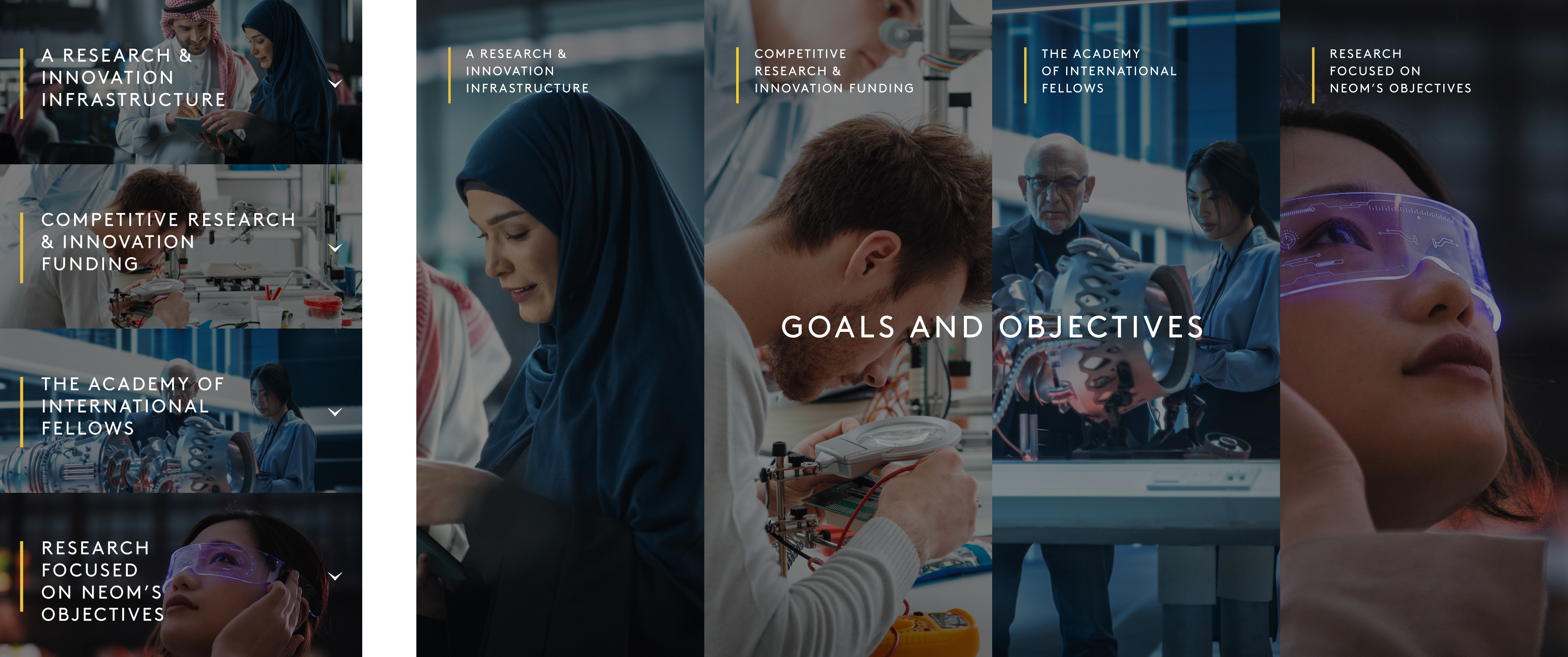
Goals, objectives and overview
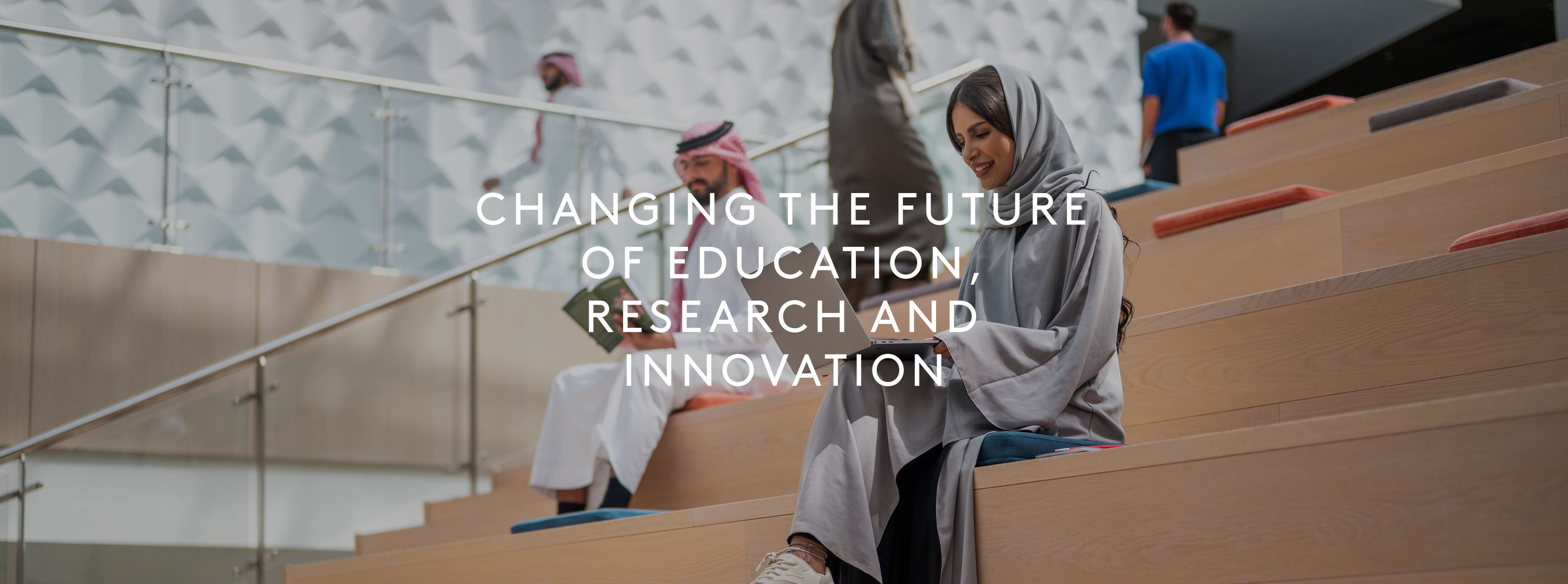
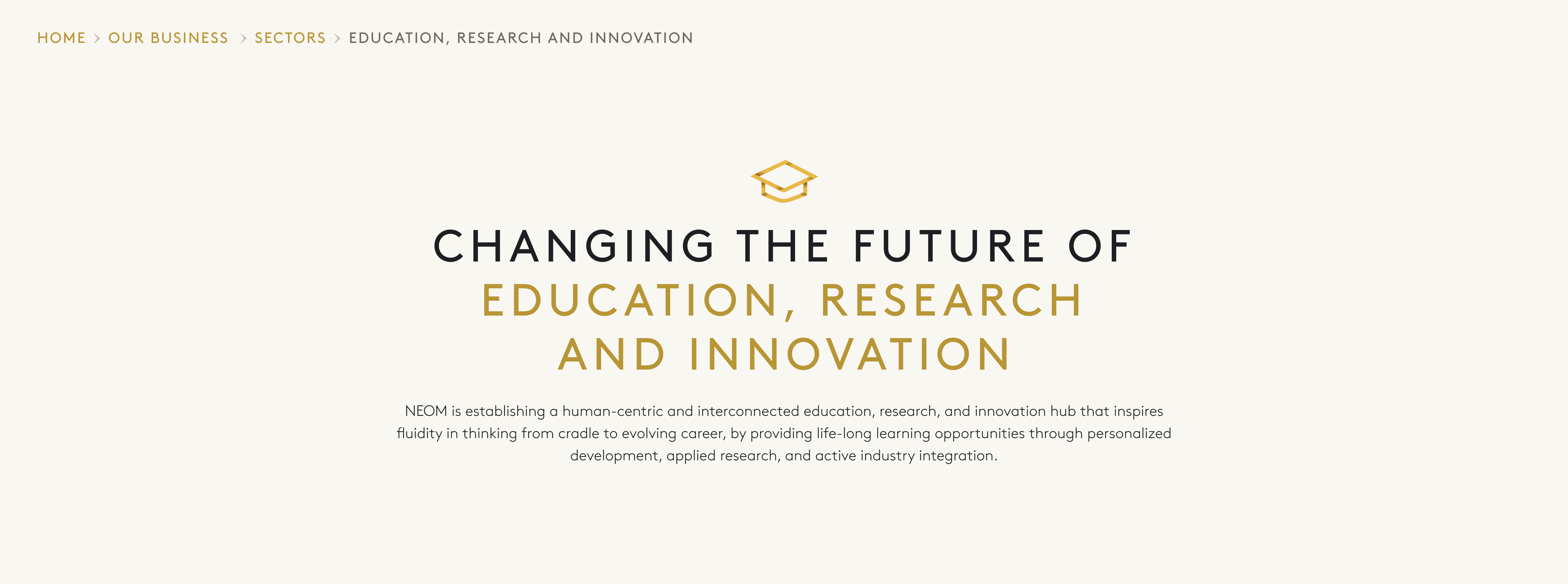
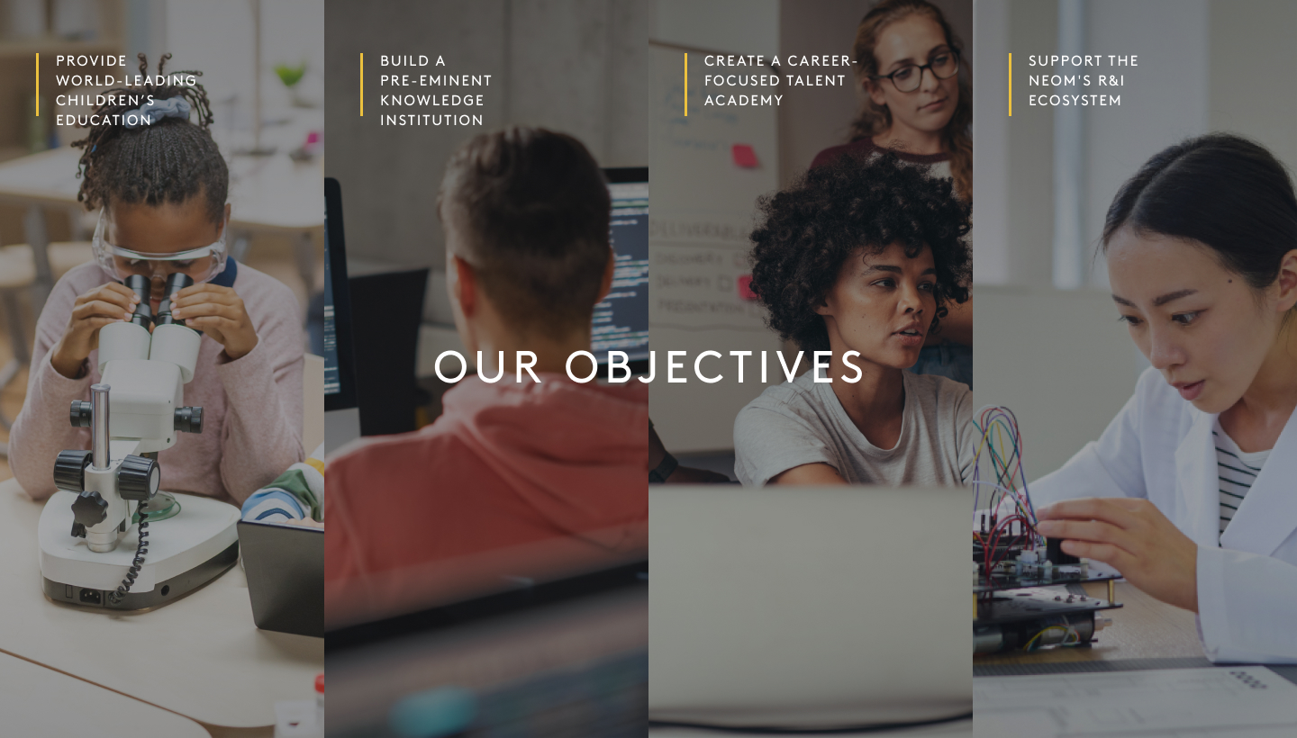
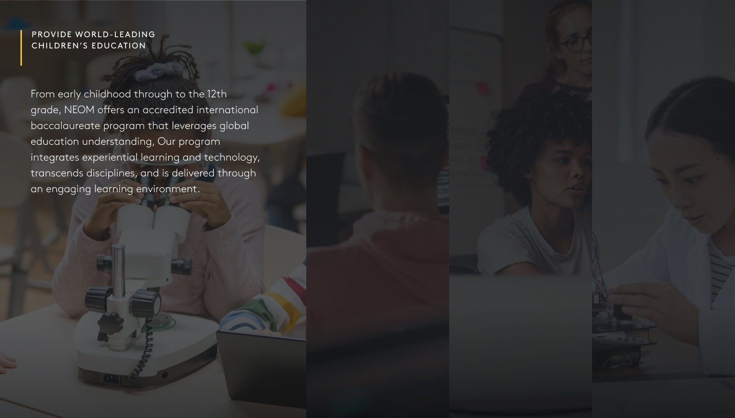
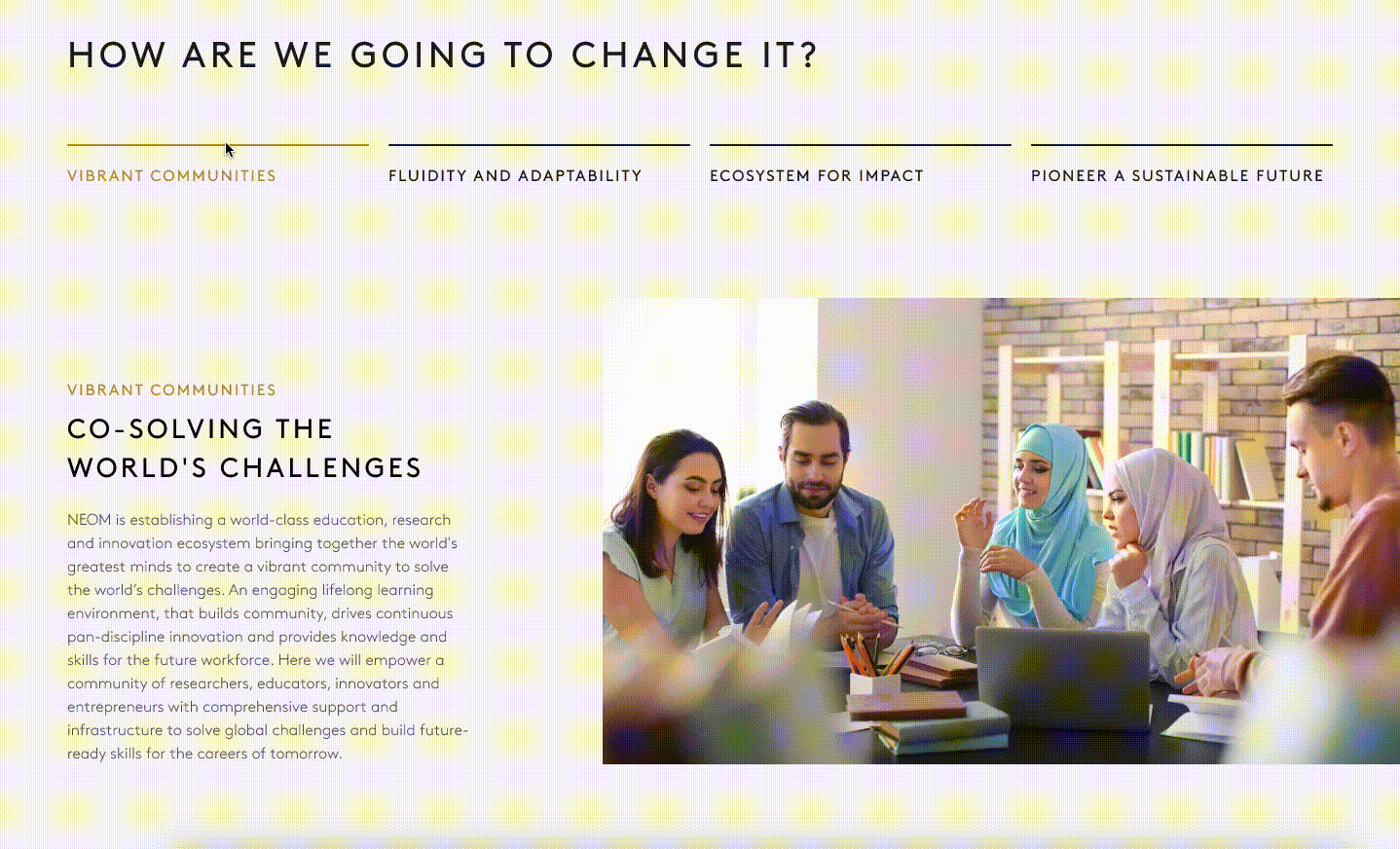
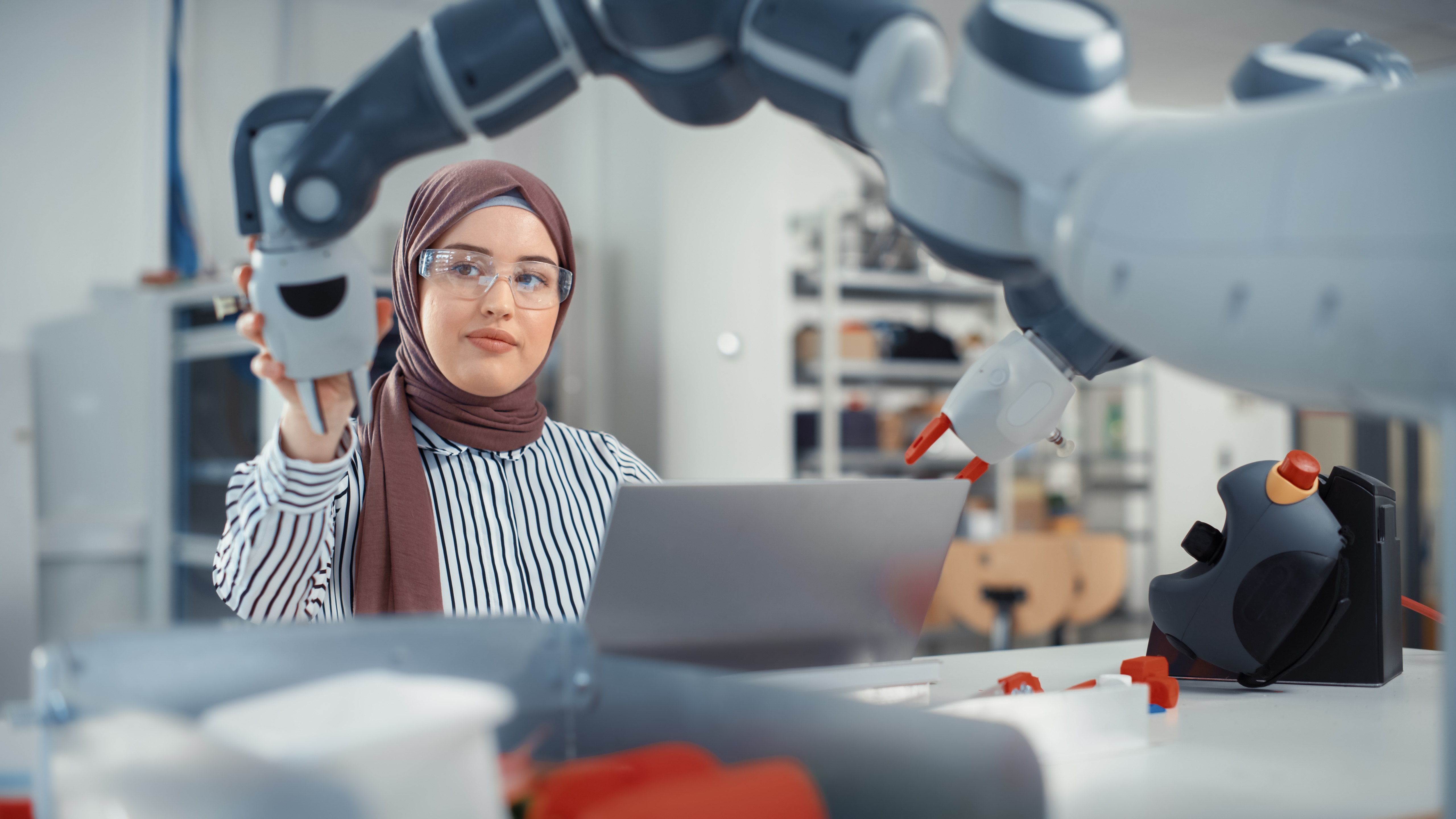
The Education, Research and Innovation Sector aims to transform education into a lifelong experience that utilizes cutting-edge, high-tech, and personalized learning capabilities, and inspire the world’s greatest minds. We were challenged to reflect these points by designing a web page for desktop and mobile focusing on this particular sector.
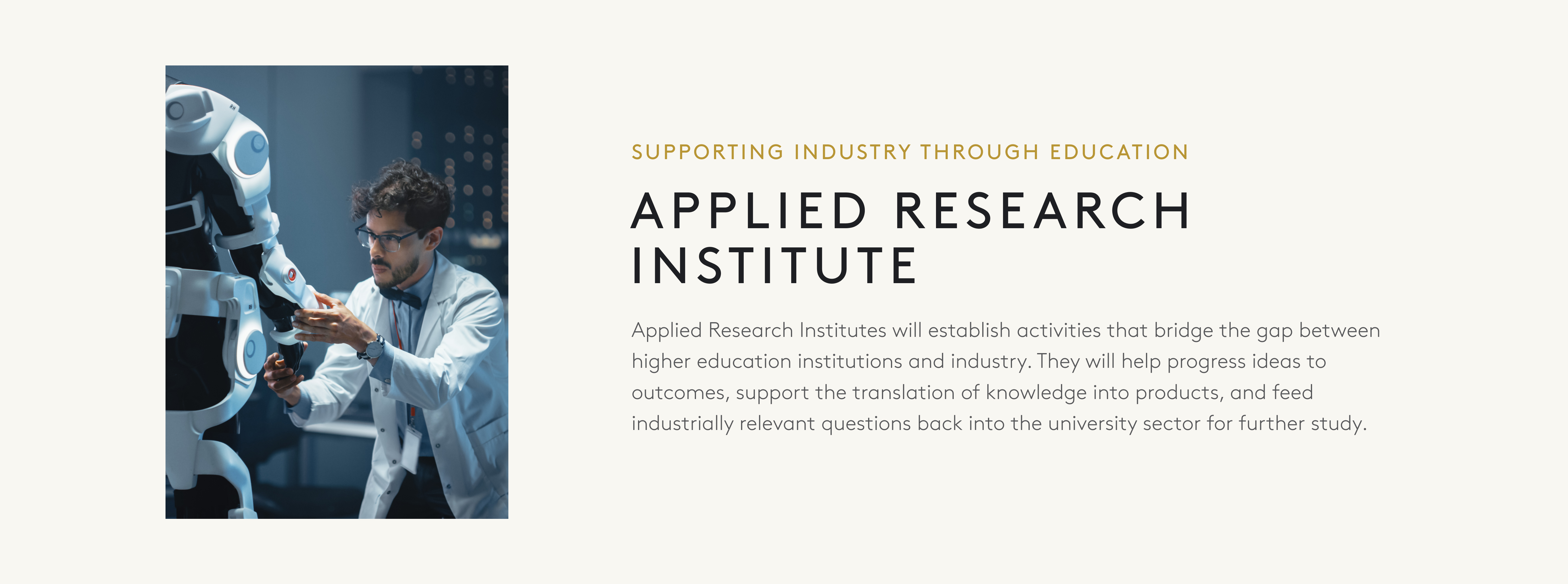
Research and innovation
We created two sub pages to focus on different areas of education. The NEOM culture is about learning by doing, combining knowledge, creativity, and critical thinking with the latest technology and a digital mindset. We developed a design system and asset library for consistency across all pages and to ensure we abide by Neom’s design language.
Consistency through a comprehensive design system
Prioritizing responsiveness, the design system ensures a seamless user experience across various devices. It adapts to different screen sizes, optimizing the presentation of content for both desktop and mobile users.
Following the Atomic Design method allowed us to create a library of interactive components. By using component properties we sped up our workflow and easily created reusable and adjustable components. It is structured with modular components to promote consistency and efficiency in design implementation. This modular approach allows for flexibility in content presentation while maintaining a unified visual identity.
Following the Atomic Design method allowed us to create a library of interactive components. By using component properties we sped up our workflow and easily created reusable and adjustable components. It is structured with modular components to promote consistency and efficiency in design implementation. This modular approach allows for flexibility in content presentation while maintaining a unified visual identity.
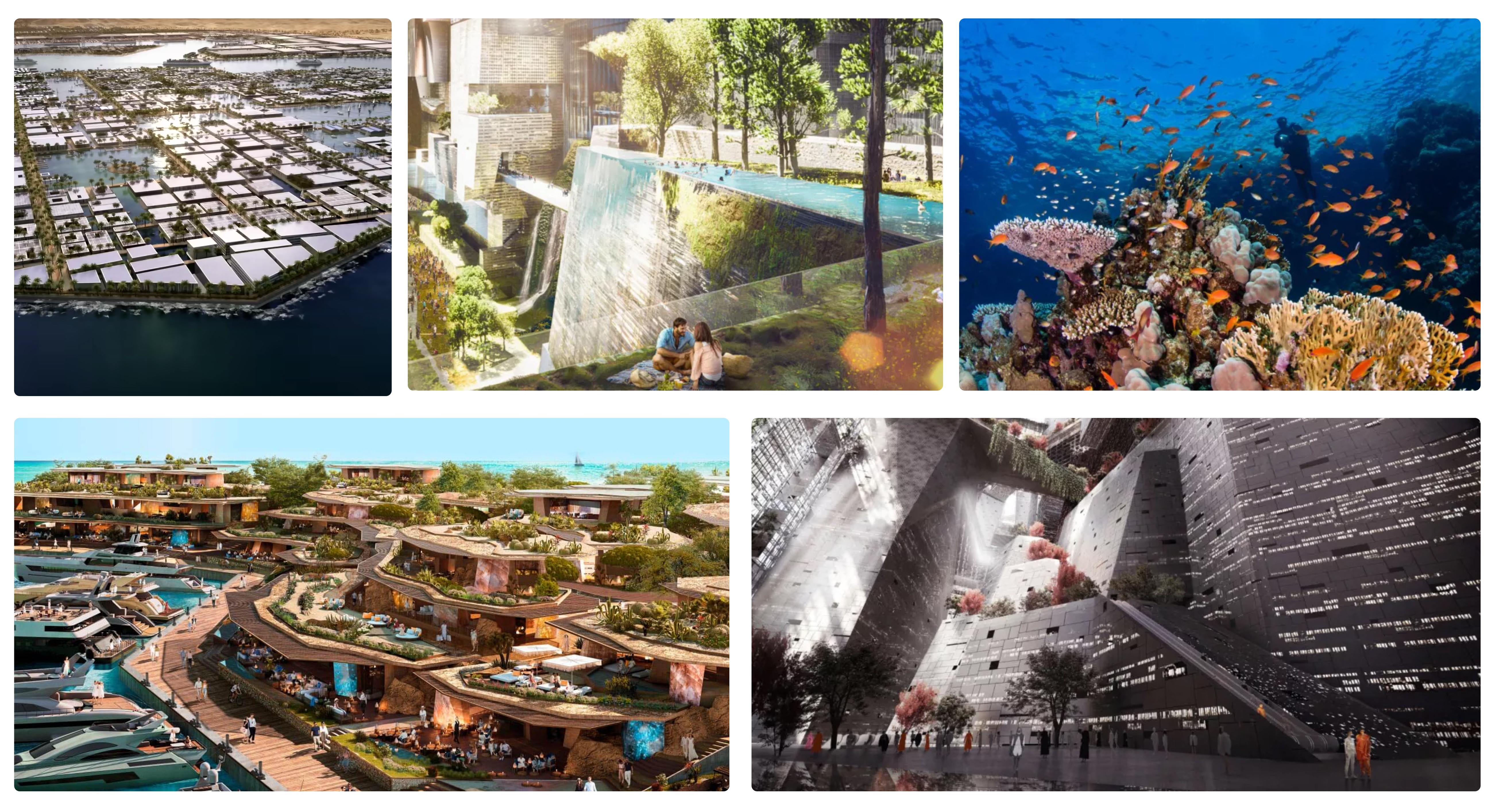
Asset Selection -

All images are owned by Neom
I carefully curated a selection of imagery that would convey the right information, set the tone, and create a positive impression. It was important to keep these points in mind - The Middle East is a region with diverse cultures and customs. Using culturally sensitive images ensures respect for local traditions, values, and sensitivities. The final selection of images resonate with the local context and architectural style to help the audience relate to the project. These images aim to tell a compelling story that showcase the project's progress, milestones, challenges overcome, and the expected result.
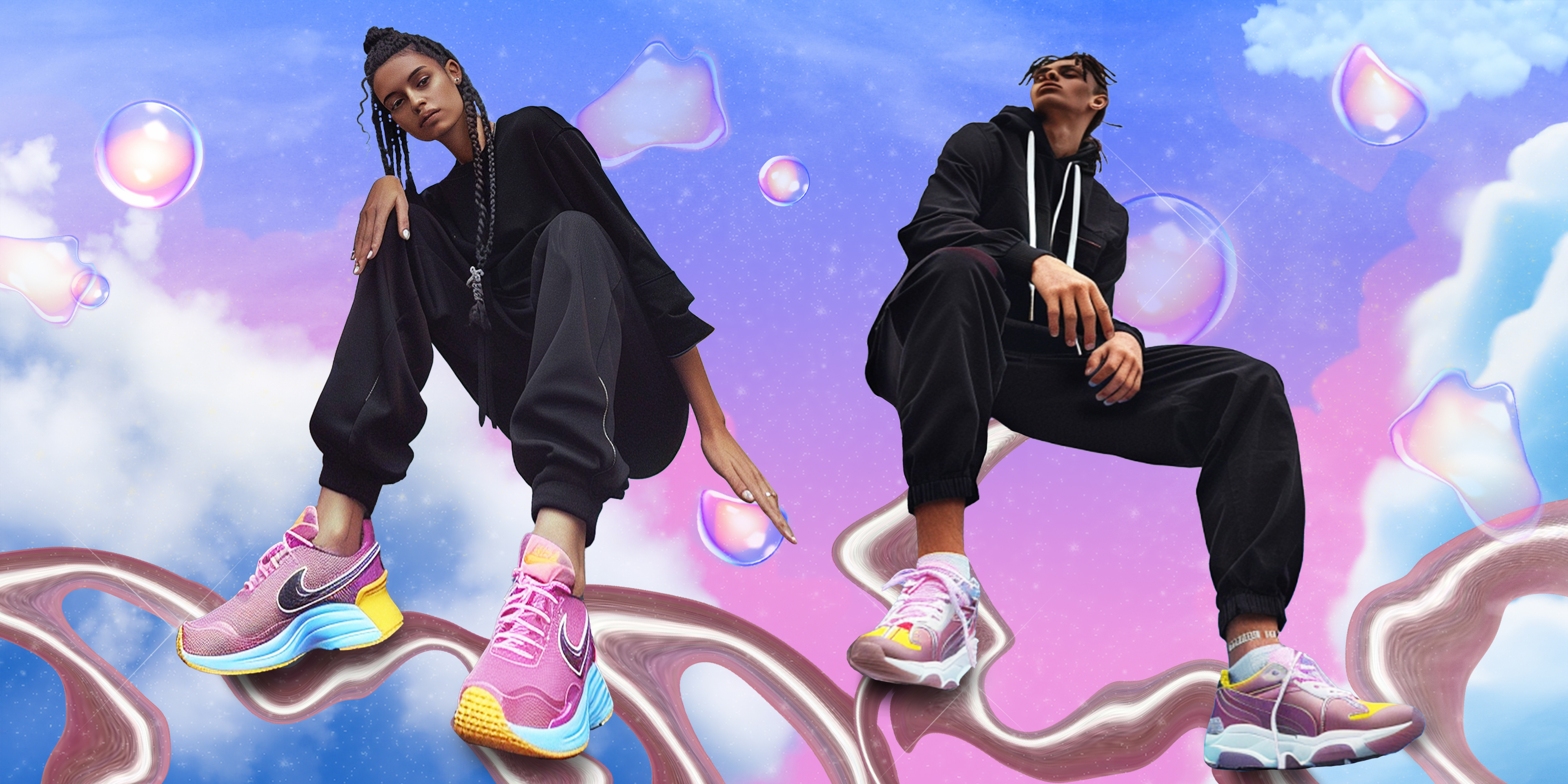
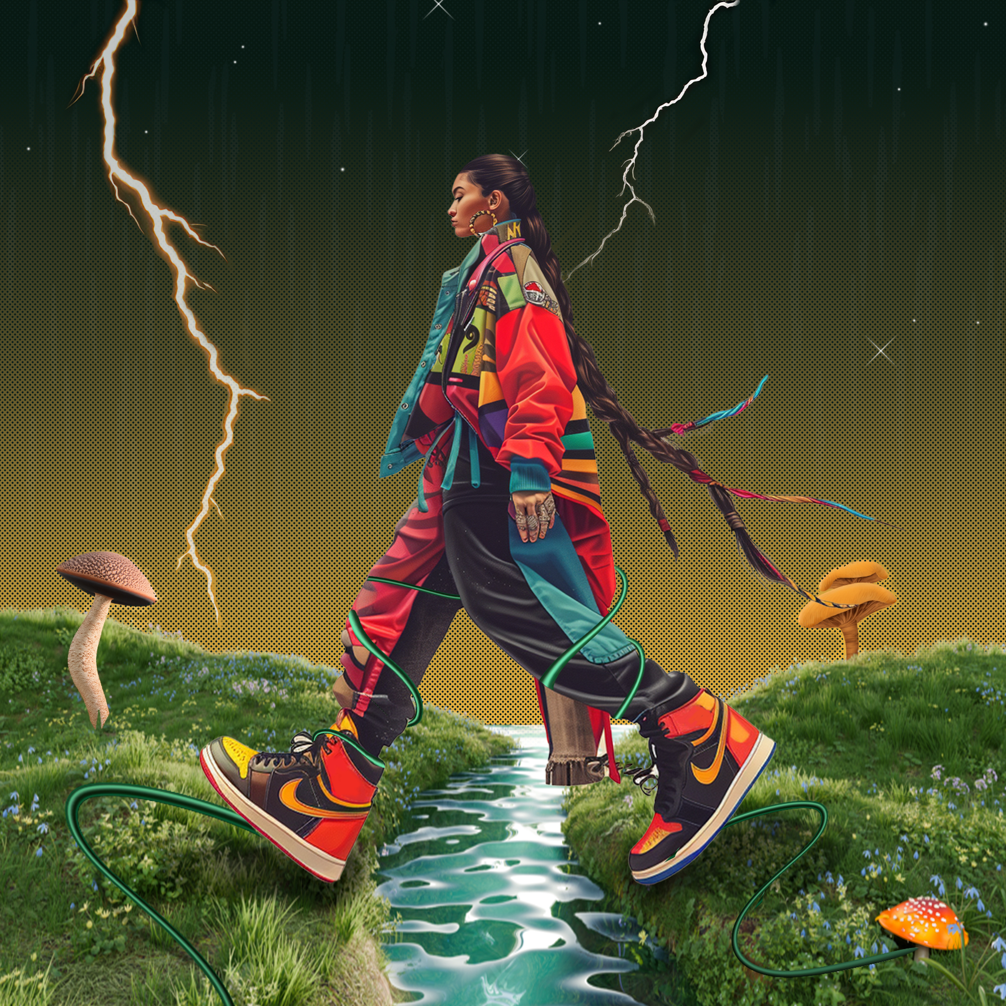
Nike Future Footprints -
Step up, shape tomorrow
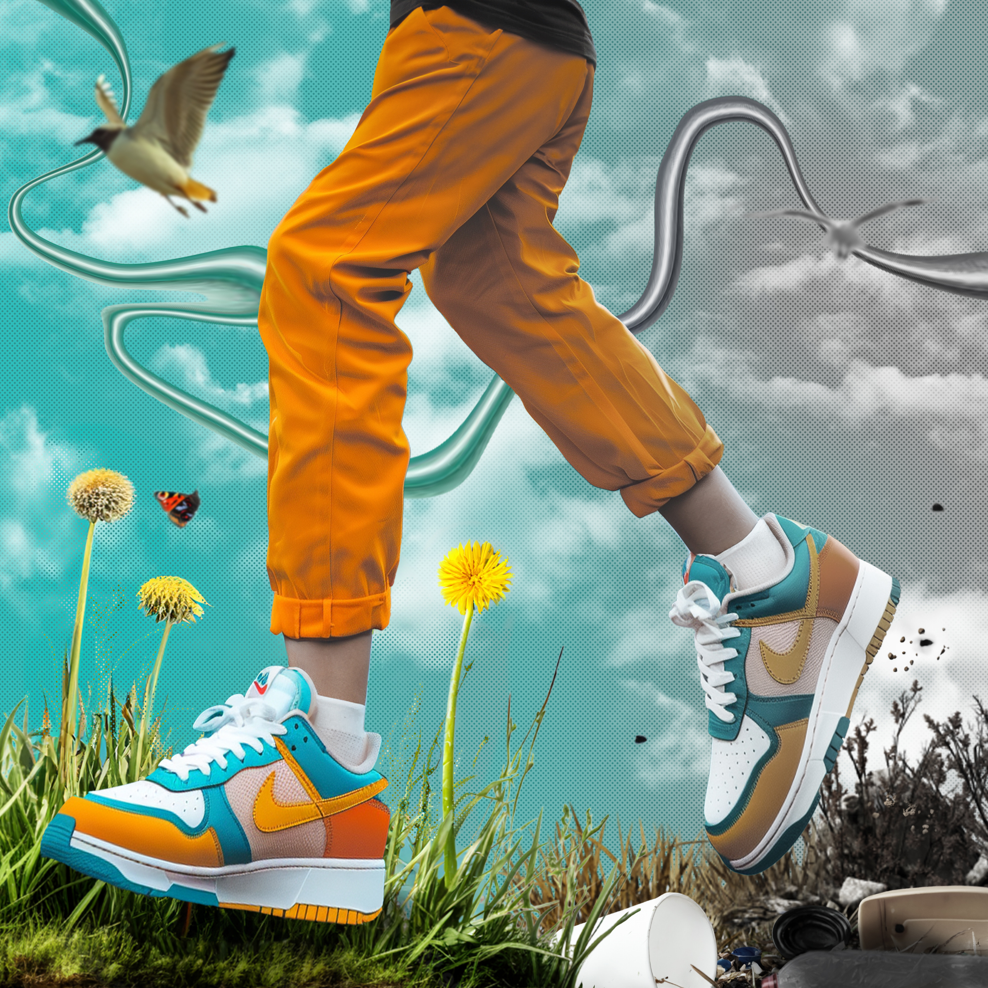
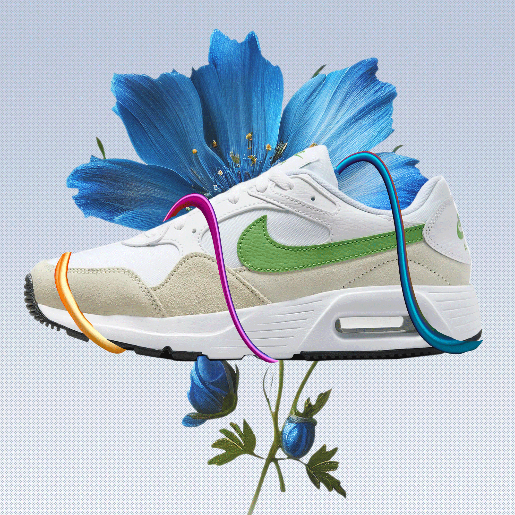
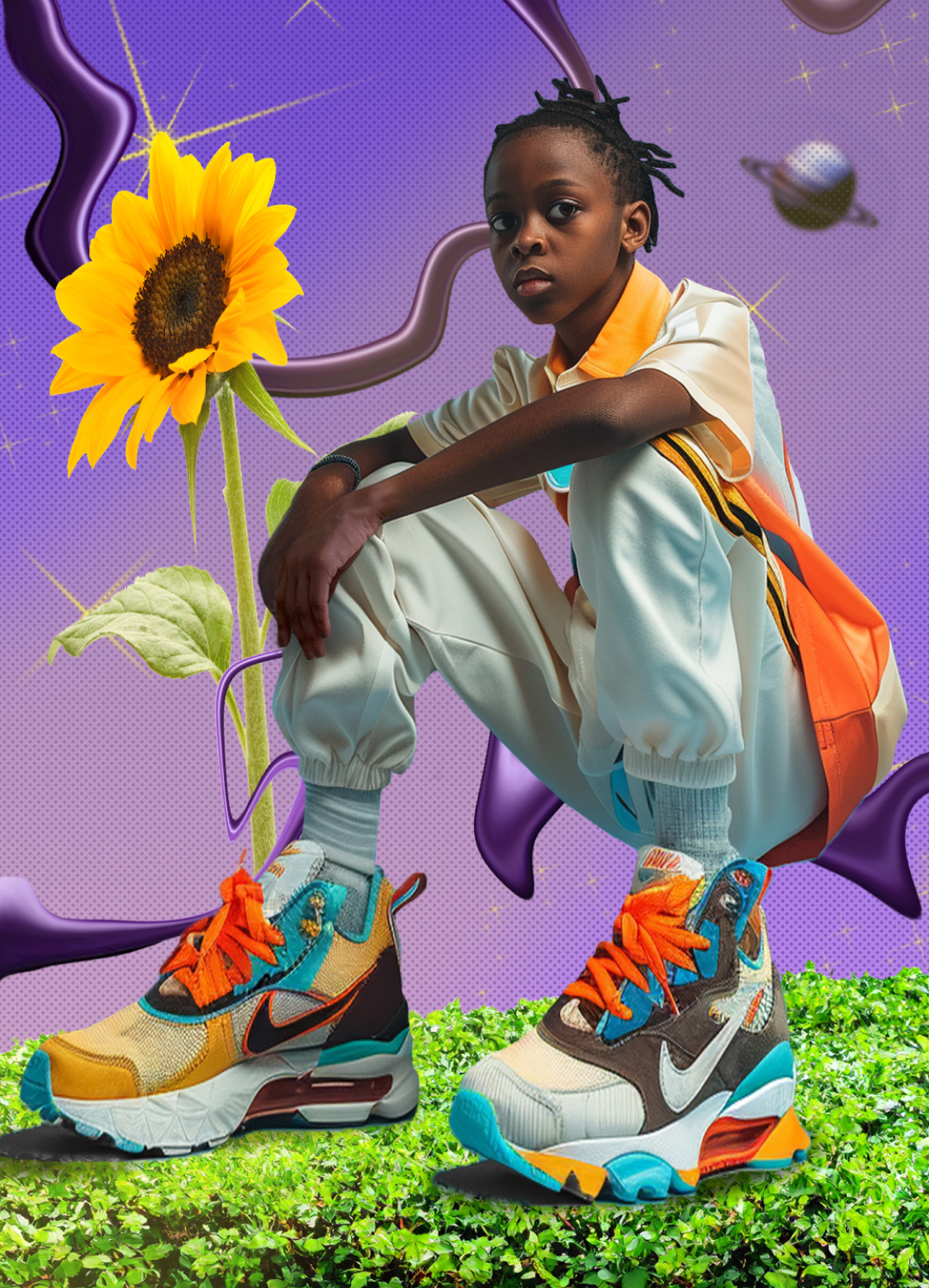
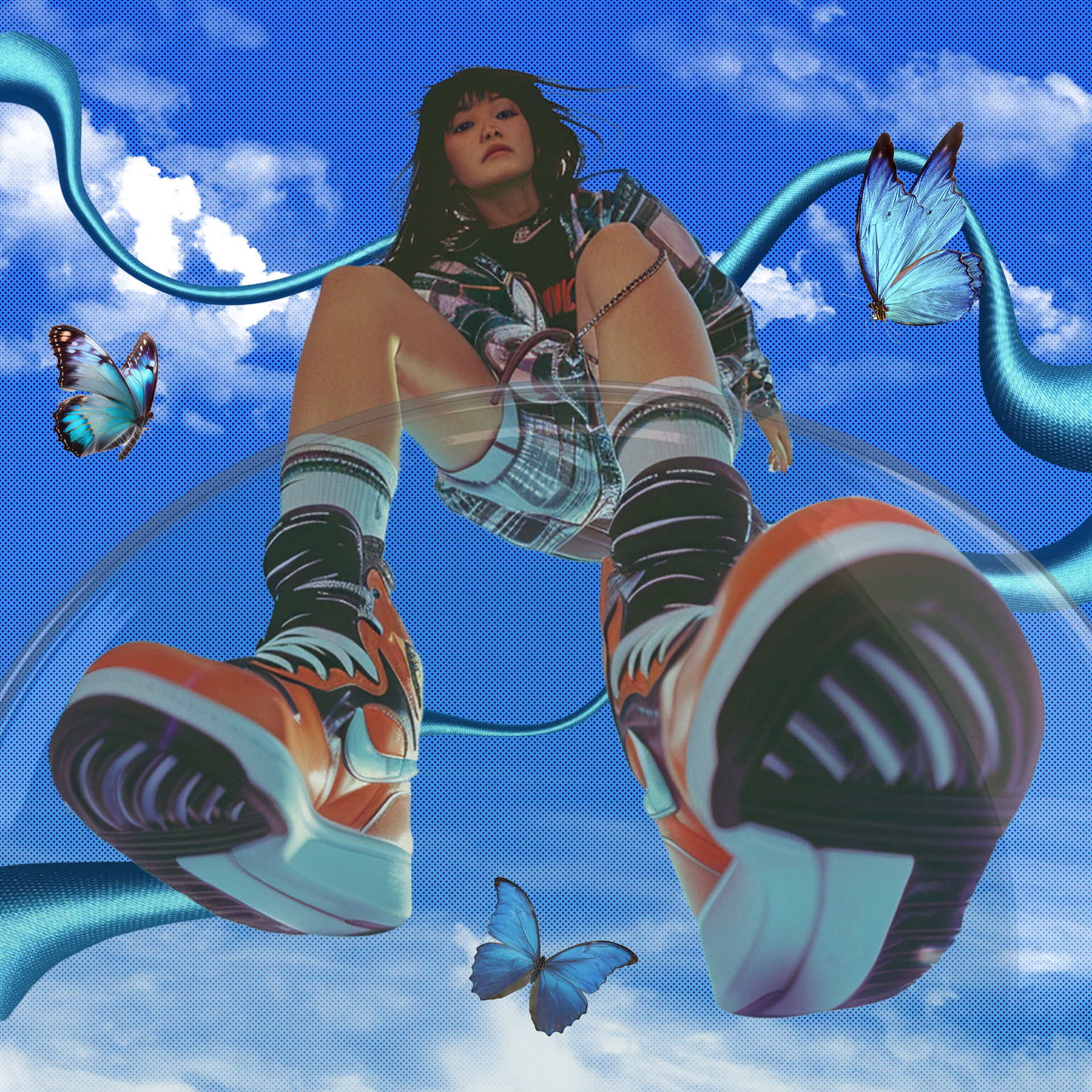
Nike's "Future Footprints" campaign aims to inspire and empower the next generation to make sustainable choices while staying active and stylish. The campaign focuses on three key pillars: Education, Action, and Community.
Nike apparel labelled with 'sustainable materials' has at least 50% recycled content. The brand hopes to significantly reduce its emissions and impact by reusing, recycling, and repurposing existing materials.
Role : Generative AI, Art Direction, Photo editing
Tools : Figma, Photoshop, Midjourney, ChatGPT
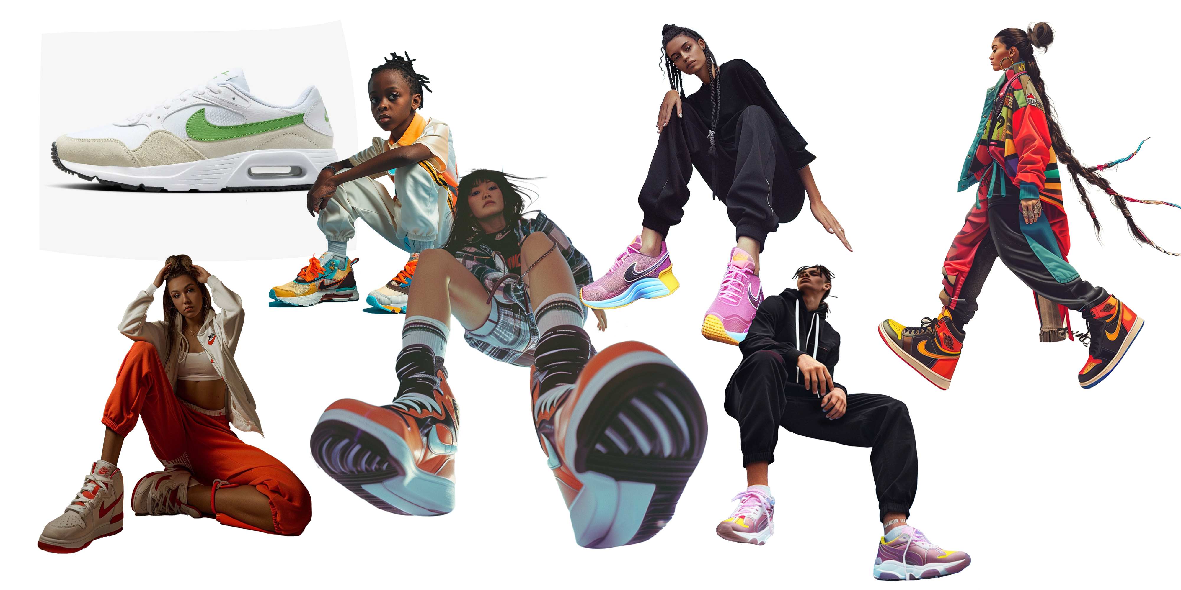
Generative AI imagery
The process began by brainstorming and putting together a moodboard to best understand what visual language would be ideal for the campaign. Vibrant and eye-catching imagery featuring young people wearing Nike's sustainable product line in urban, outdoor settings showing a bright future of the planet was the set direction. By using Midjourney I generated assets or photography of the intended users wearing Nike’s products and then went on to use Photoshop to create the backdrops.
Photoshop Wizardry
The idea was to showcase models wearing Nike’s products in a future proof sustainable fantasy. Going all out with editing and having fun, I created a magical land where one leaves behind unwanted plastic, carbon and waste and enters a new clean world.
#GreenKicks: Showcase Nike's sustainable footwear collection on Instagram and TikTok, highlighting the eco-friendly materials used in production and how they contribute to fighting climate change. Encourage users to share their favorite styles and why sustainability matters to them.
#NikeNatureWalks: Organize virtual nature walks led by environmental experts or athletes wearing Nike sustainable gear. Encourage participants to share their outdoor experiences and eco-friendly habits on social media, tagging Nike and using the campaign hashtag.
#GreenGoals: Challenge Gen Z to set personal sustainability goals for themselves, such as reducing single-use plastics or participating in local environmental clean-up events, and share their progress on Instagram and TikTok using Nike products as part of their journey.
Nike and consumers can collaborate by prioritizing sustainable materials and production methods, reducing waste through recycling programs, and advocating for environmental stewardship. By choosing Nike products made with eco-friendly materials and participating in recycling initiatives, consumers can align with Nike's sustainability goals and collectively reduce our environmental impact. Through mutual commitment and action, Nike and consumers can contribute to a more sustainable future for the planet.
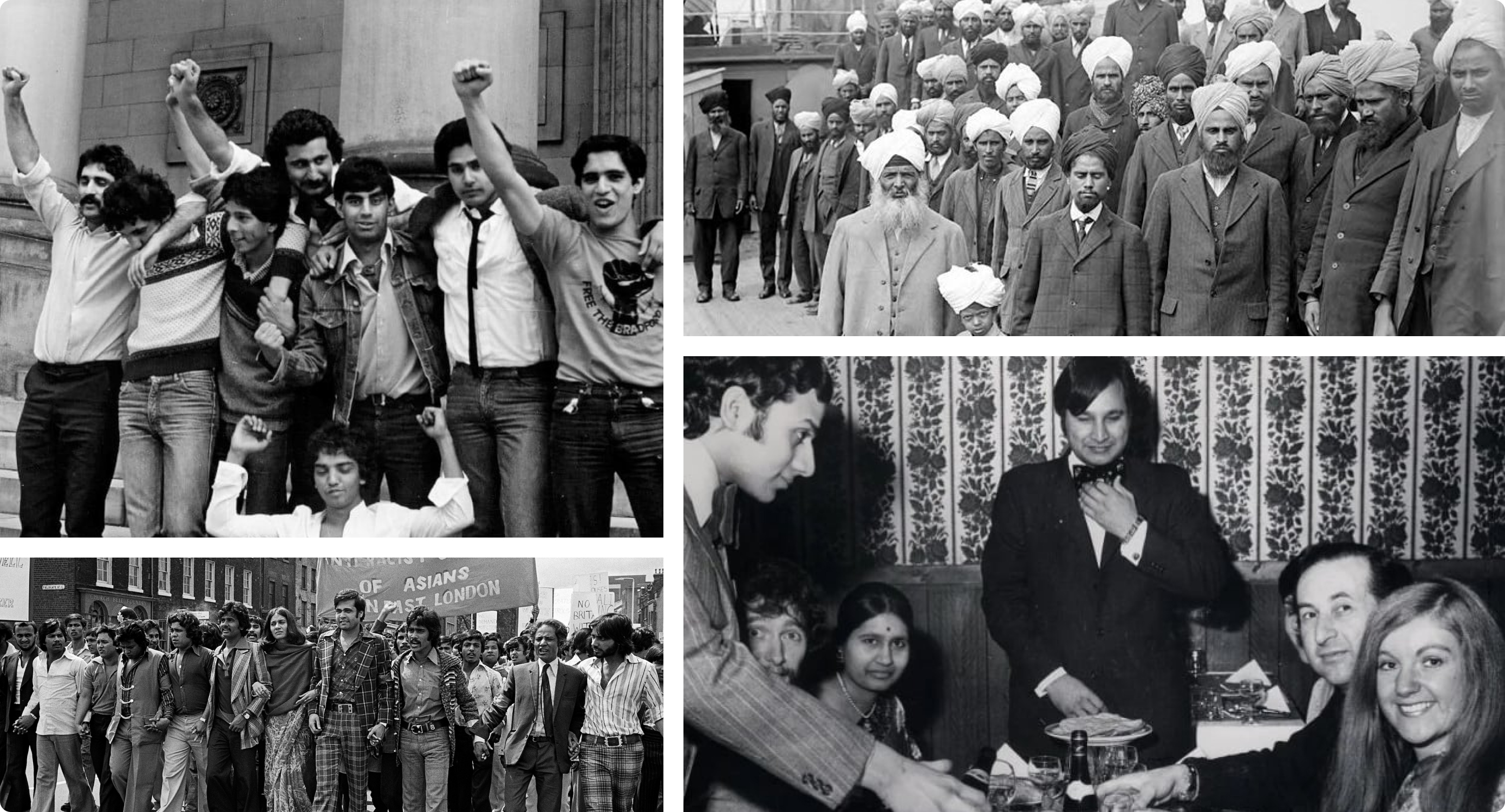
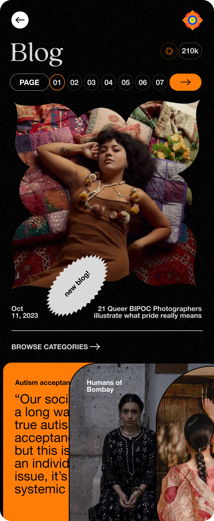
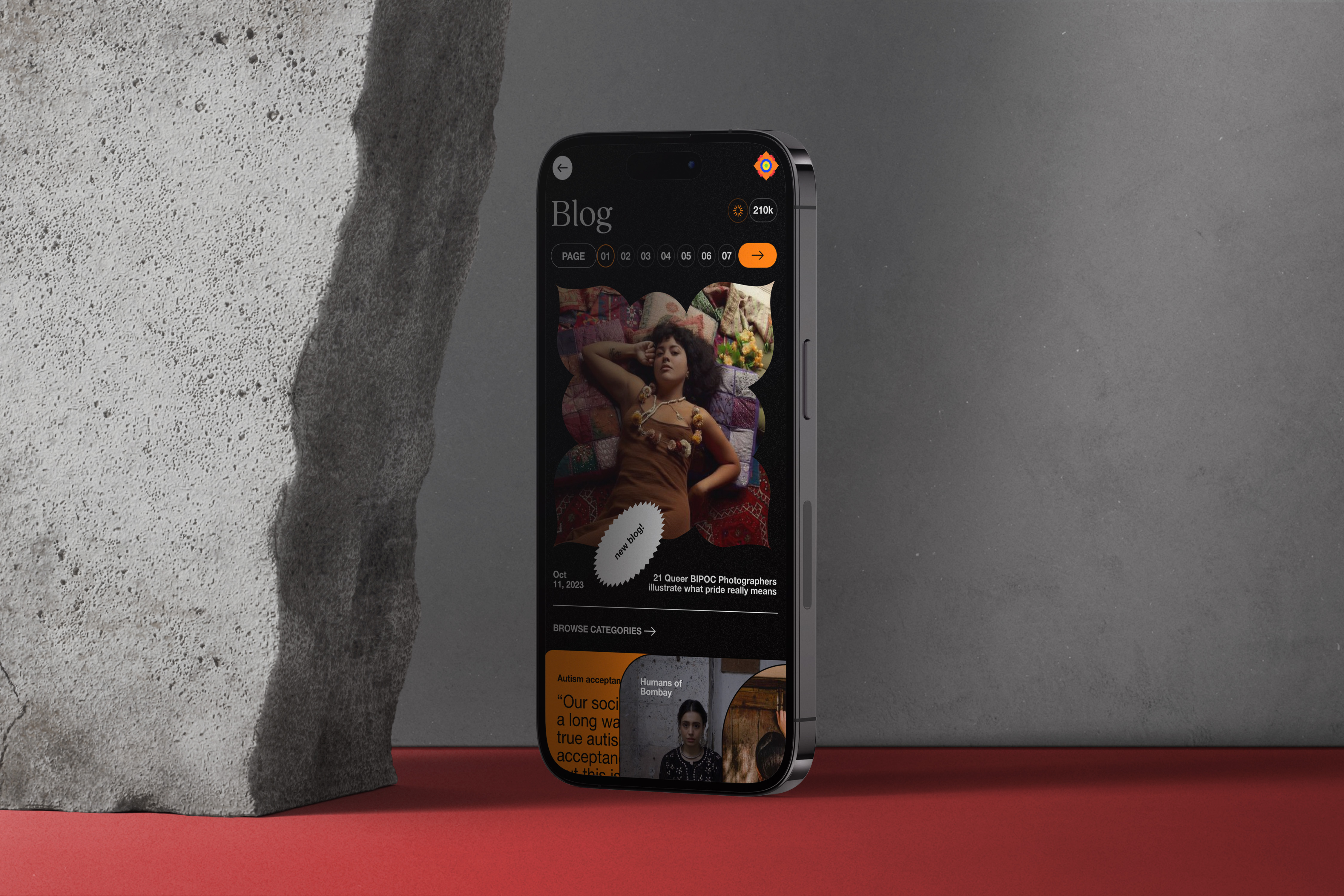
Kore - A south asian cultural hub platform
Increasing on-screen representation of historically excluded populations remains a directional North Star for the media industry, and progress is being made. That progress, however, is measured using a very general lens. There is an increasing need for our community to convey our uniqueness and find each other in our homes away from home. This personal project tries to find a solution to bridge this representation and community gap.
Role : UX/UI, Design System, Prototyping
Tools : Figma, Photoshop, Illustrator
Role : UX/UI, Design System, Prototyping
Tools : Figma, Photoshop, Illustrator
Concept and overview
Why is the South Asian community important?
The current population of Southern Asia is 2,032,672,723 as of September 2023. Southern Asia population is equivalent to 25.2% of the total world population. The contributions made or being made by the South Asian diasporas around the globe are now being recognised. The members of these communities are contributing to both the countries in which they work and live as well as those from which they originate.
The current population of Southern Asia is 2,032,672,723 as of September 2023. Southern Asia population is equivalent to 25.2% of the total world population. The contributions made or being made by the South Asian diasporas around the globe are now being recognised. The members of these communities are contributing to both the countries in which they work and live as well as those from which they originate.
One of the most remarkable aspects of South Asian migrants abroad is their sense of community. They create close-knit social networks, establishing support systems that help newcomers adapt to their new environments. In the United States, as in other countries, some diaspora desis are creating a "fusion" culture, in which foods, fashions, music, and the like from many areas of South Asia are "fused" both with each other and with elements from Western culture. Their strong sense of community and shared cultural values bring them together, fostering the preservation and promotion of South Asian heritage in their adopted countries.
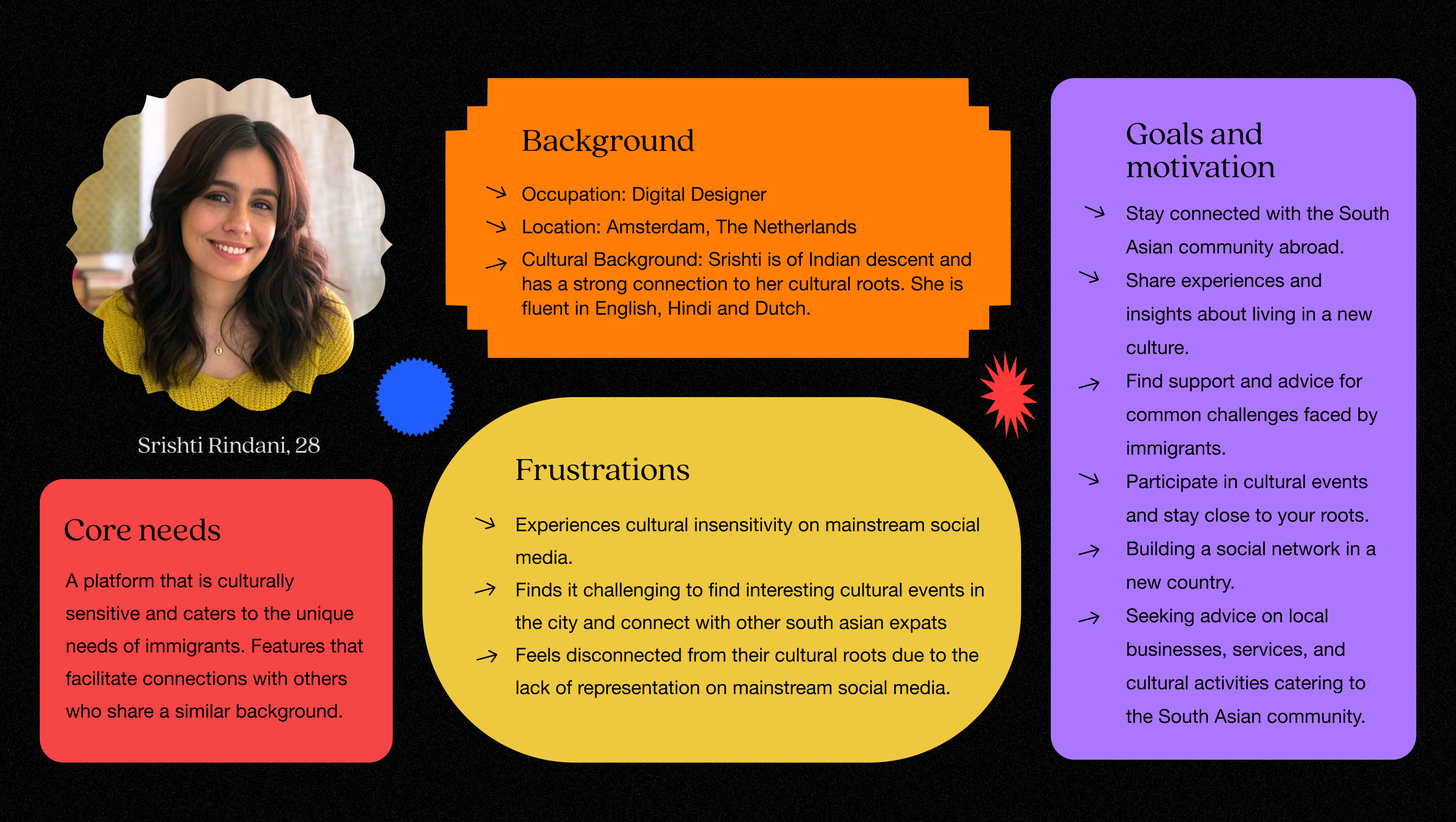
The user
From a south asian woman living in Europe’s perspective there is a lack of platforms to find this huge community living away from their homes and families to connect with each other. A platform that attracts individuals who are genuinely interested in learning about the traditions, languages, cuisine, and history of South Asia. Where professionals in the field of event planning, artists, musicians, and dancers can promote their work or find opportunities to collaborate with others who share their passion. To connect, share culture, learn from each other and share our stories. This is where the title comes from - Kore which means home in Pashto (Iran).
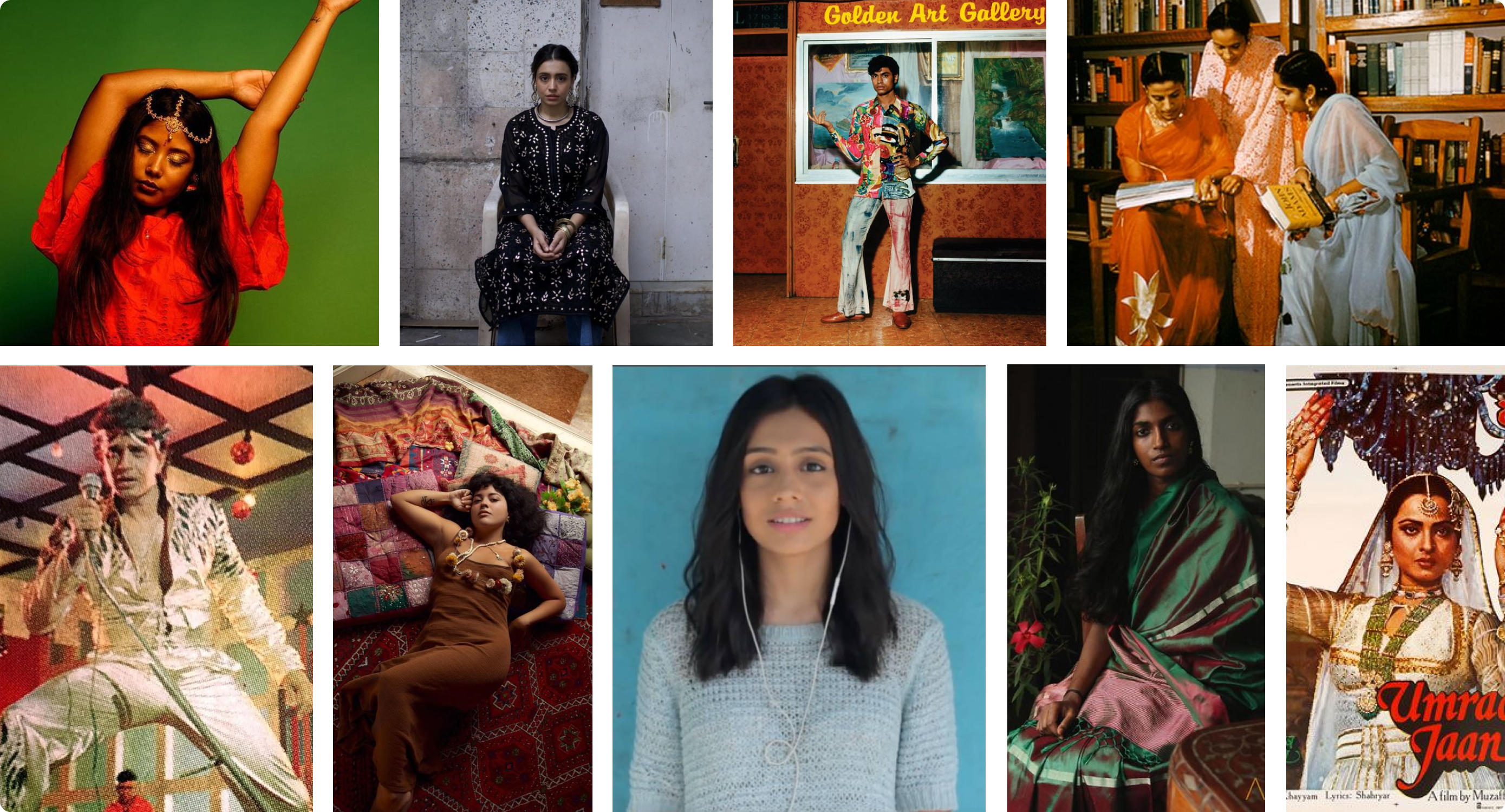
Creating the brand
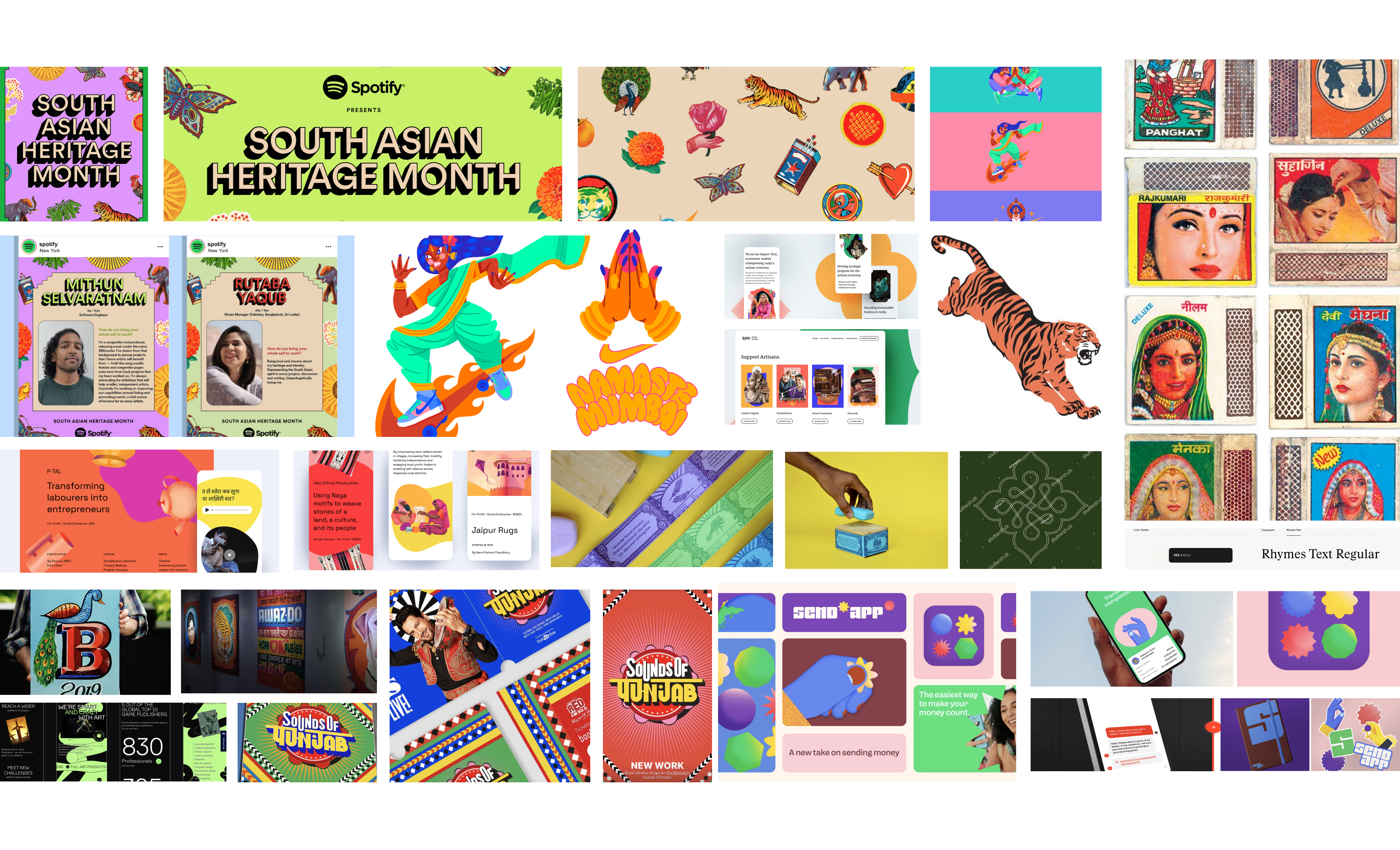
After collecting and creating a moodboard of south asian advertisements, graphic design work, album art, movie posters, campaign images it was clear the communication language is vibrant, energetic and eye catching. Creating a mood board helped define ideas, color scheme and a coherent design concept keeping the bigger picture in mind.
Interface
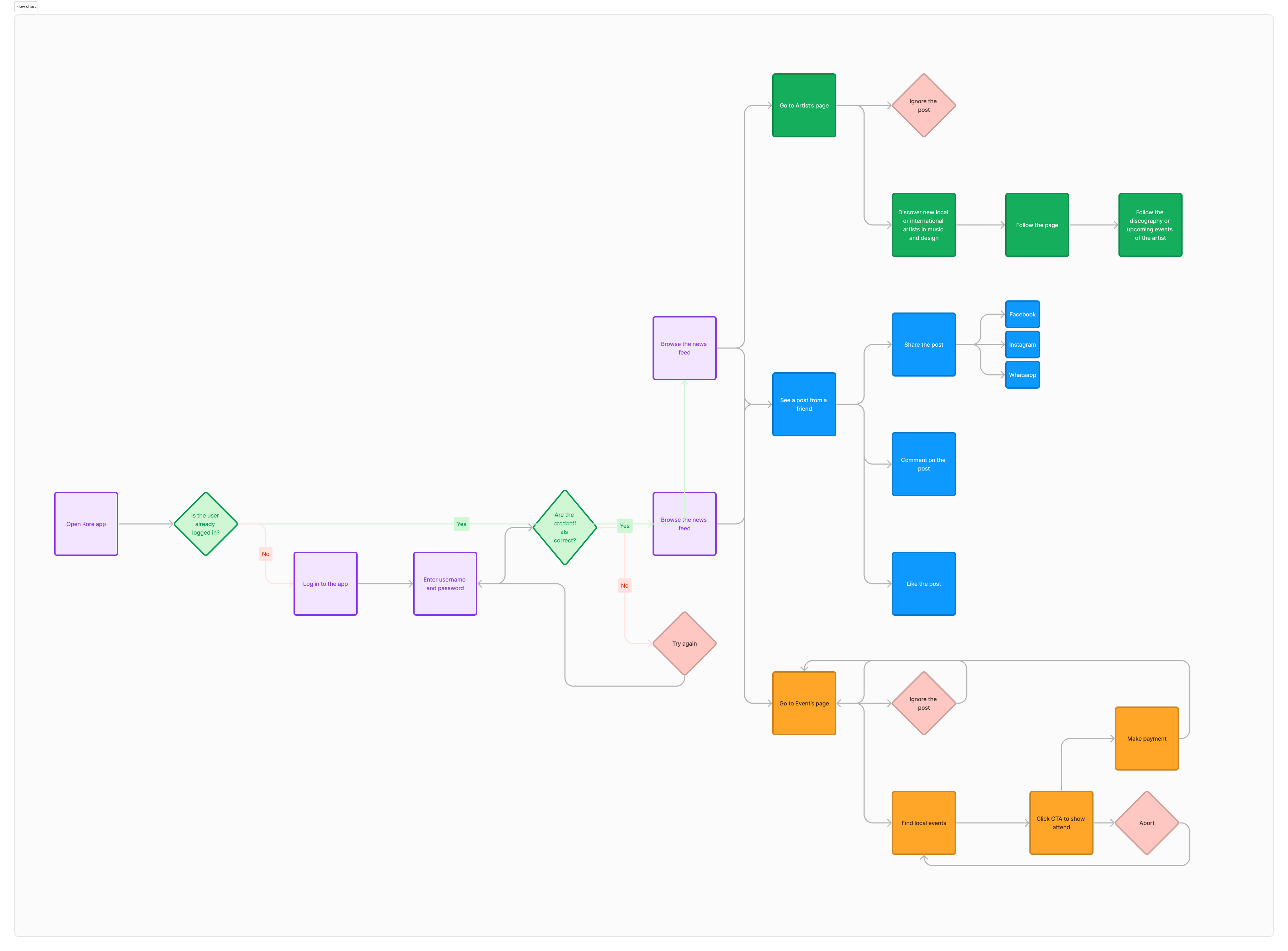
Creating a user flow helped design a seamless and user-friendly experience. I mapped the user's journey to identify and address potential issues early on, optimize task completion for cross-functional communication and allow for data-driven iterations. This ensures that the design is centered around user needs and expectations, leading to a more intuitive and satisfying experience.
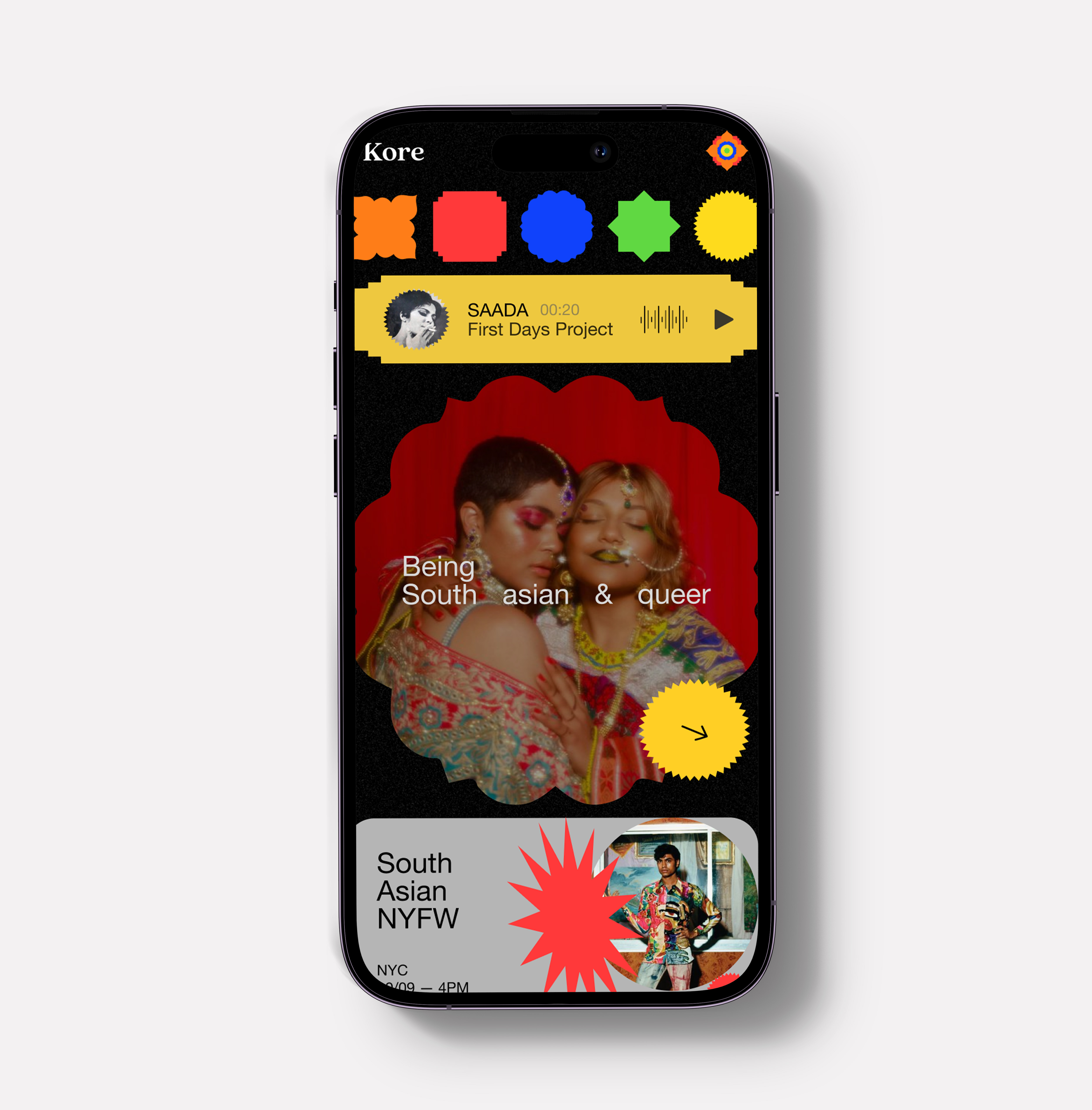
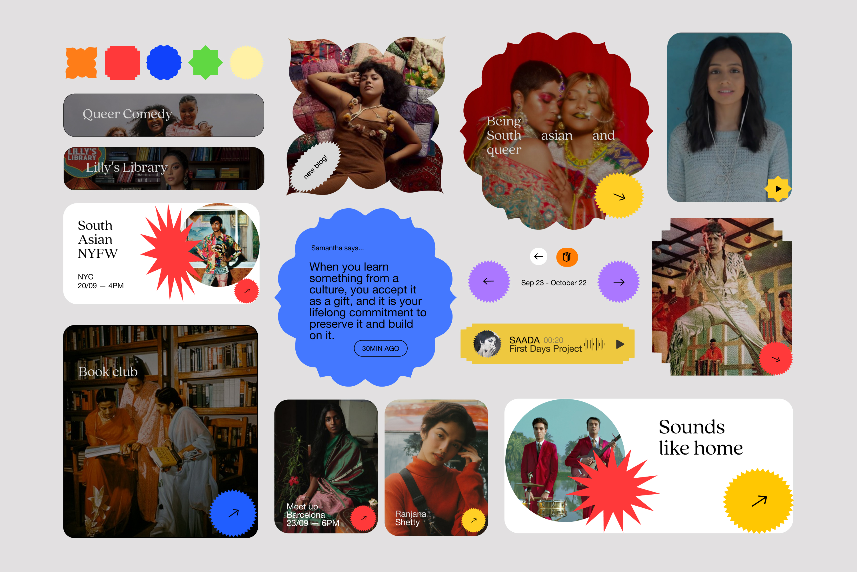
The playful patterns and graphic elements of the design give opportunity for dynamic brand collateral, ranging from vibrant and energetic, to refined and focused. Kore is brave, groundbreaking, and powerful. The interface created matches that energy. It’s dynamic, loud and active tone is balanced with playfulness to evoke a homegrown, approachable, yet credible feel. This is a platform for those seeking information, find their people and be a part of their large community away from home.
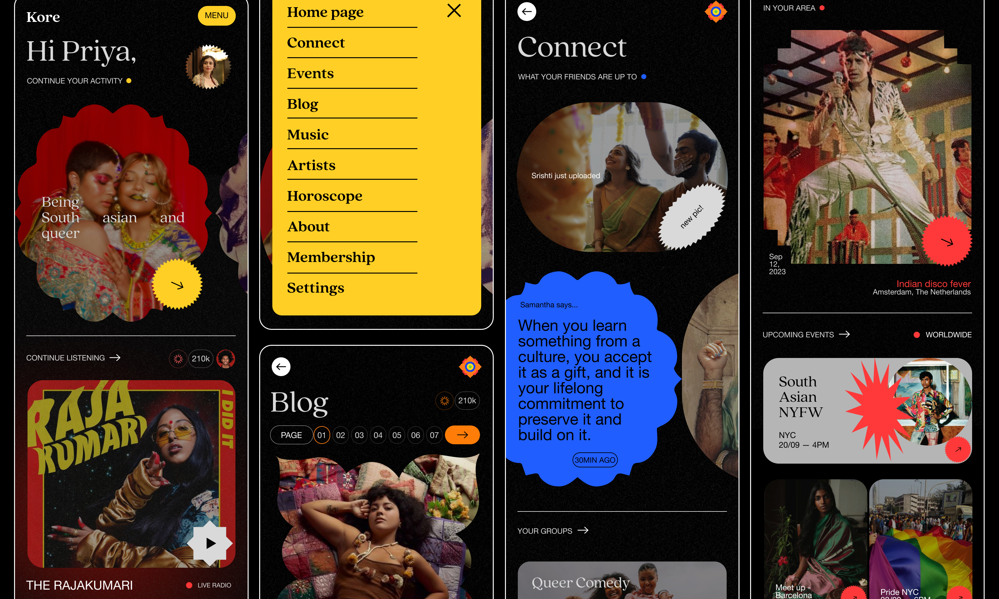
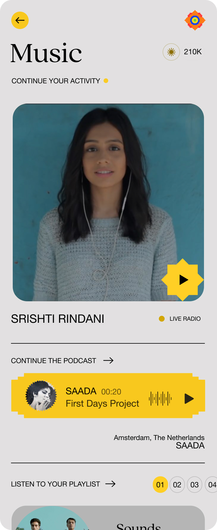
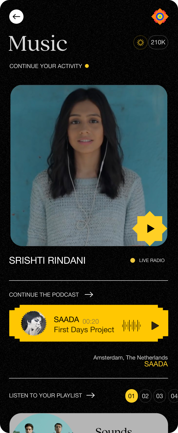
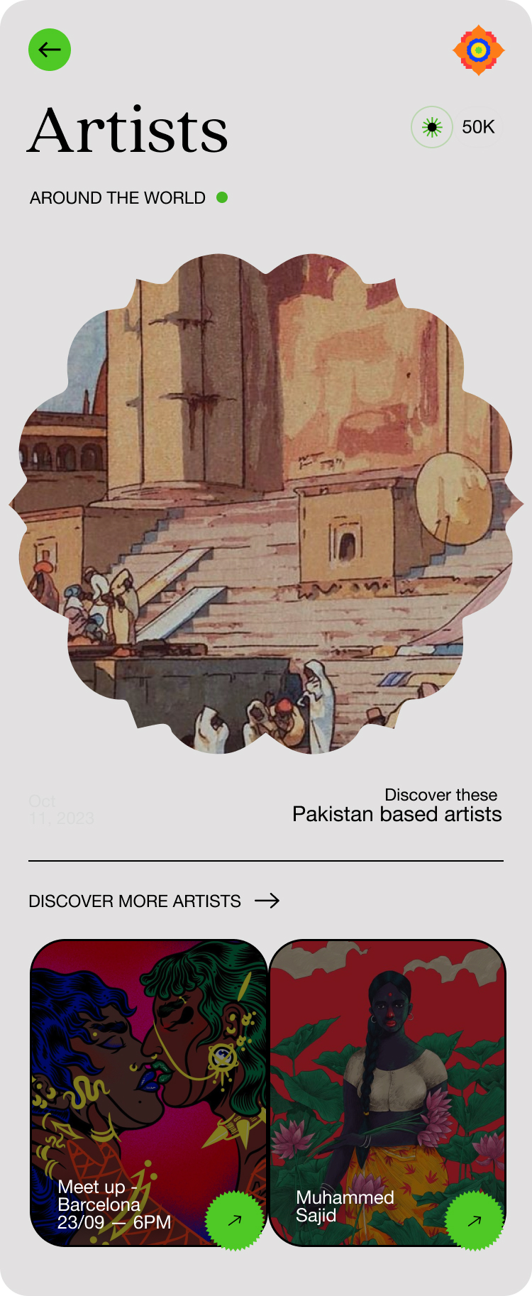
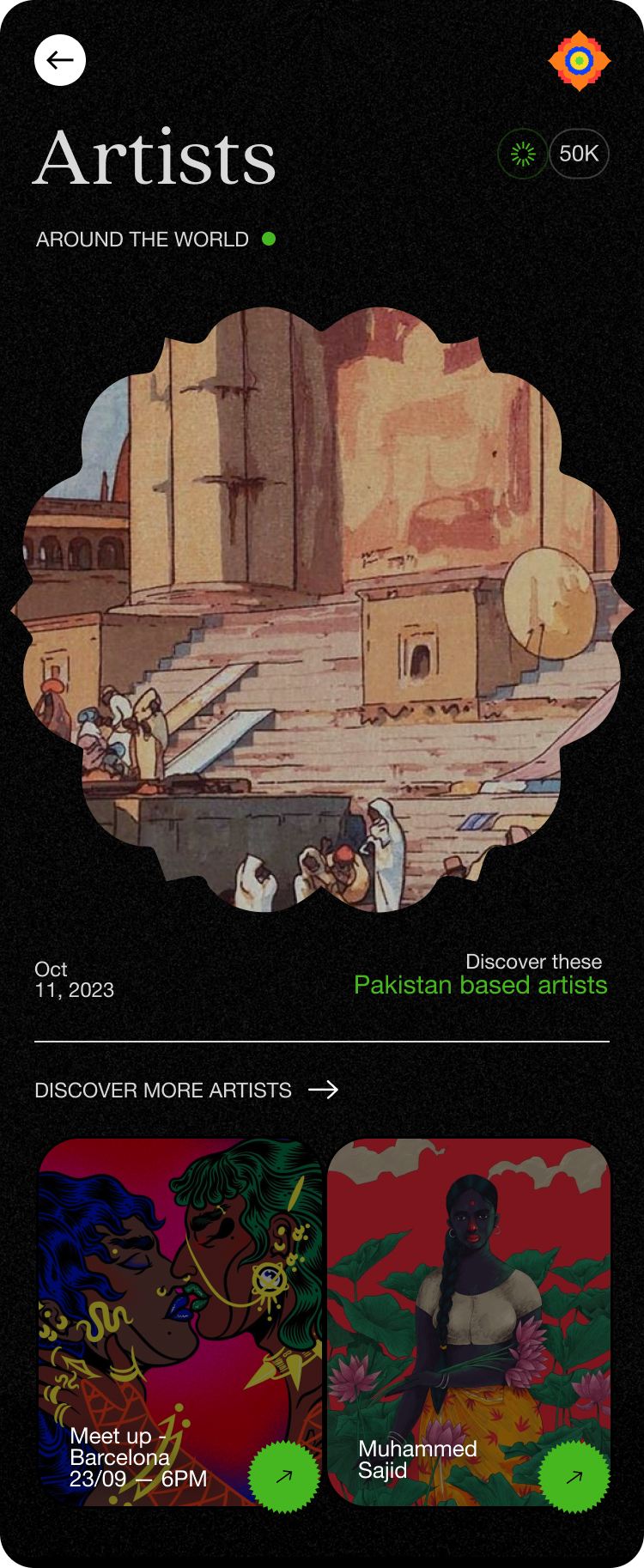
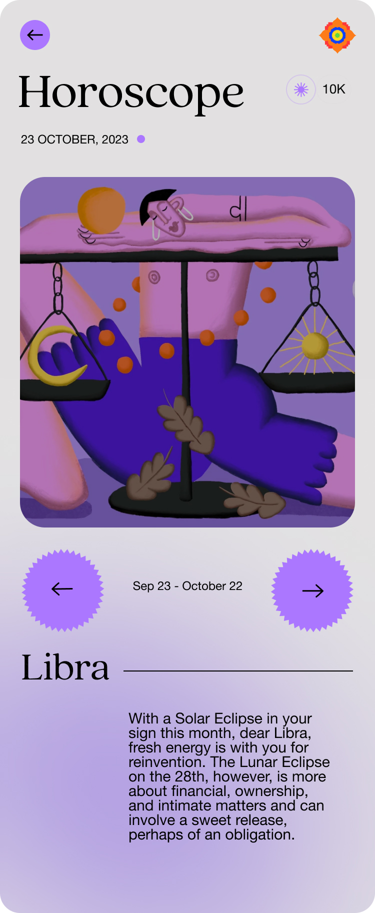
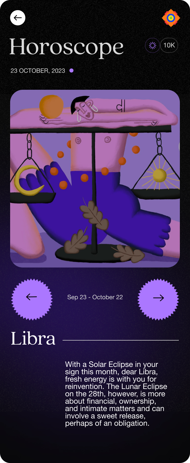
The interface includes filters for location, date, and type of event, and offers options to save or share events. It showcases South Asian art forms such as traditional dance, music, and visual arts through videos, galleries, and articles. Highlights famous artists and their contributions to the community. There is even a fun horoscope section that provides humorous projections and satire based on the Indian community’s dedication towards astrology.
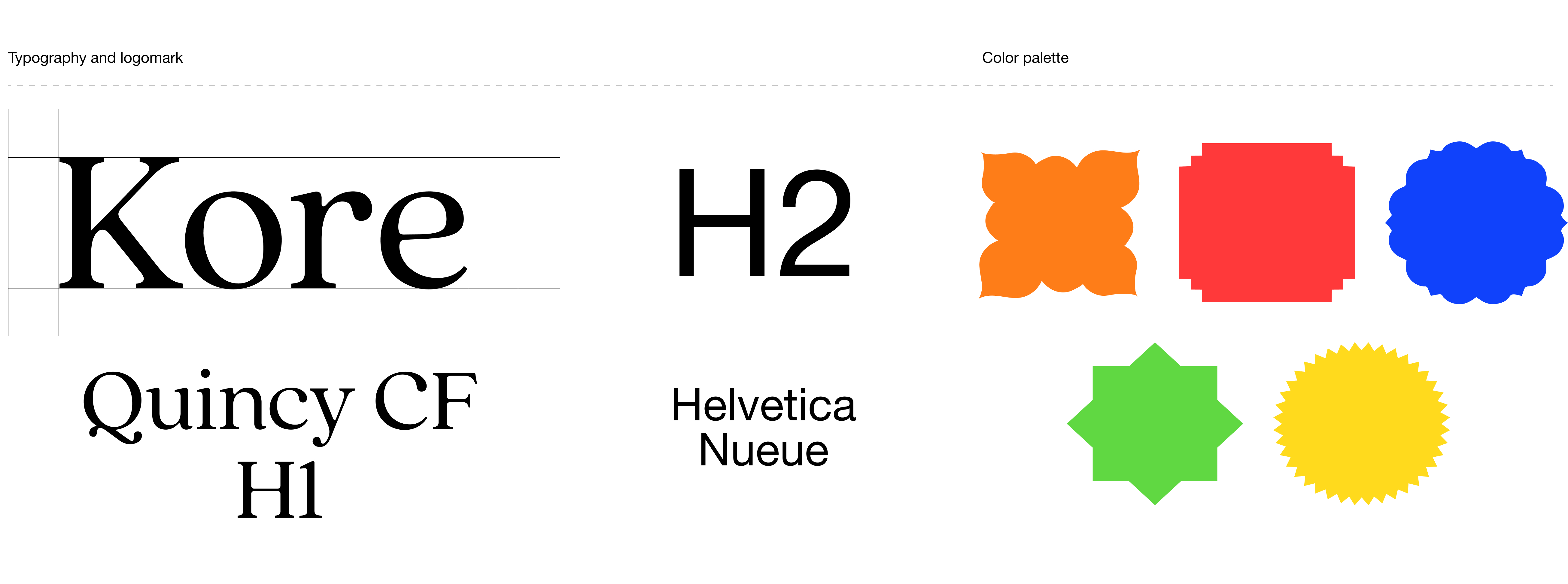
Establishing a vibrant design system
Creating a design system for a colorful South Asian cultural hub application involves a thoughtful and culturally sensitive approach. The objective is to encapsulate the richness and diversity of South Asian traditions while ensuring a user-friendly and visually appealing experience. The design system contains UI components that are intuitive and culturally relevant. This includes buttons, navigation bars, and other interface elements that incorporate traditional design elements without compromising usability. This ensures a seamless user experience across different devices.
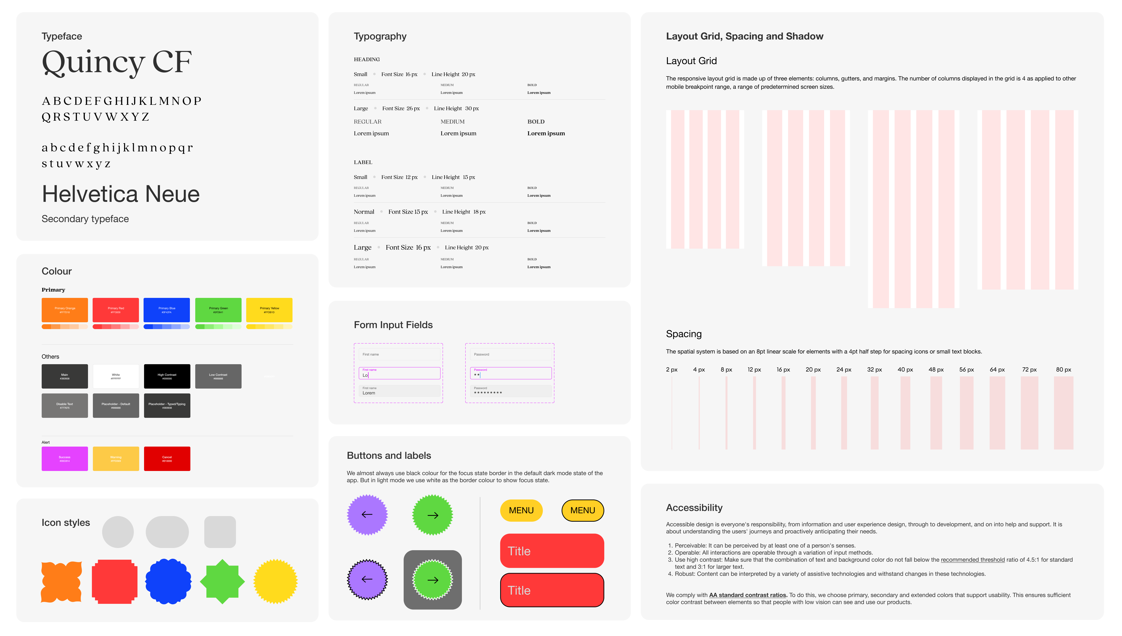
The color scheme should incorporate vibrant and rich colors commonly associated with South Asian cultures, such as deep reds, bright oranges and royal blues. These colors can be used for accents and highlights to create an inviting and visually appealing interface. Sans-serif font for bodycopy with clear readability in both English and South Asian languages like Hindi, Bengali, Urdu, and Tamil should be used to cater to a wider audience. The homepage should feature a visually striking carousel or slideshow showcasing images and events from different South Asian cultures. This can include festivals, music, talks or meetups etc.
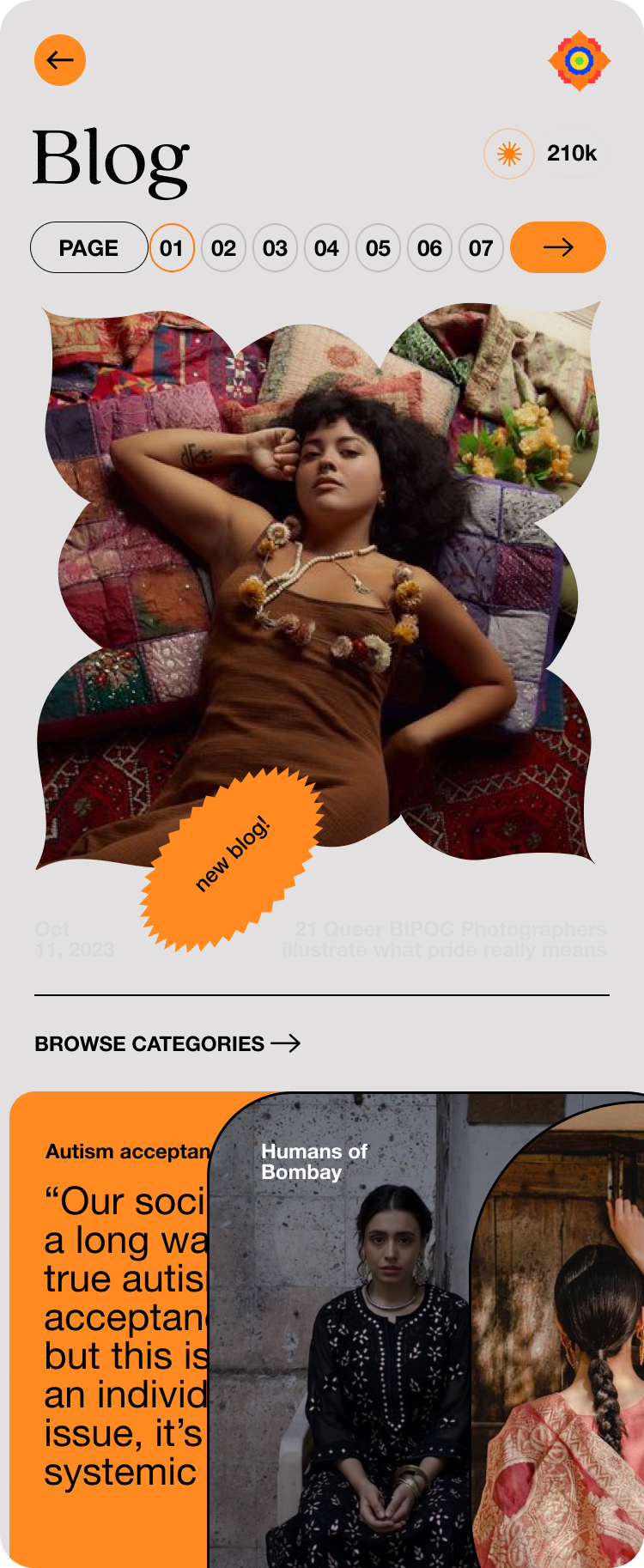
Through this platform hub, users can find popular Desi playlists, exclusive takeovers from noteworthy community members, a curation of podcasts from South Asian podcasters, community events, discover artists and designers, read blog articles. All information accumulated into a single resource. It also gives the users a chance to ask their own questions, engage with the influencer socials and most importantly connect with each other.
simPODD, an AAC app for children and teens
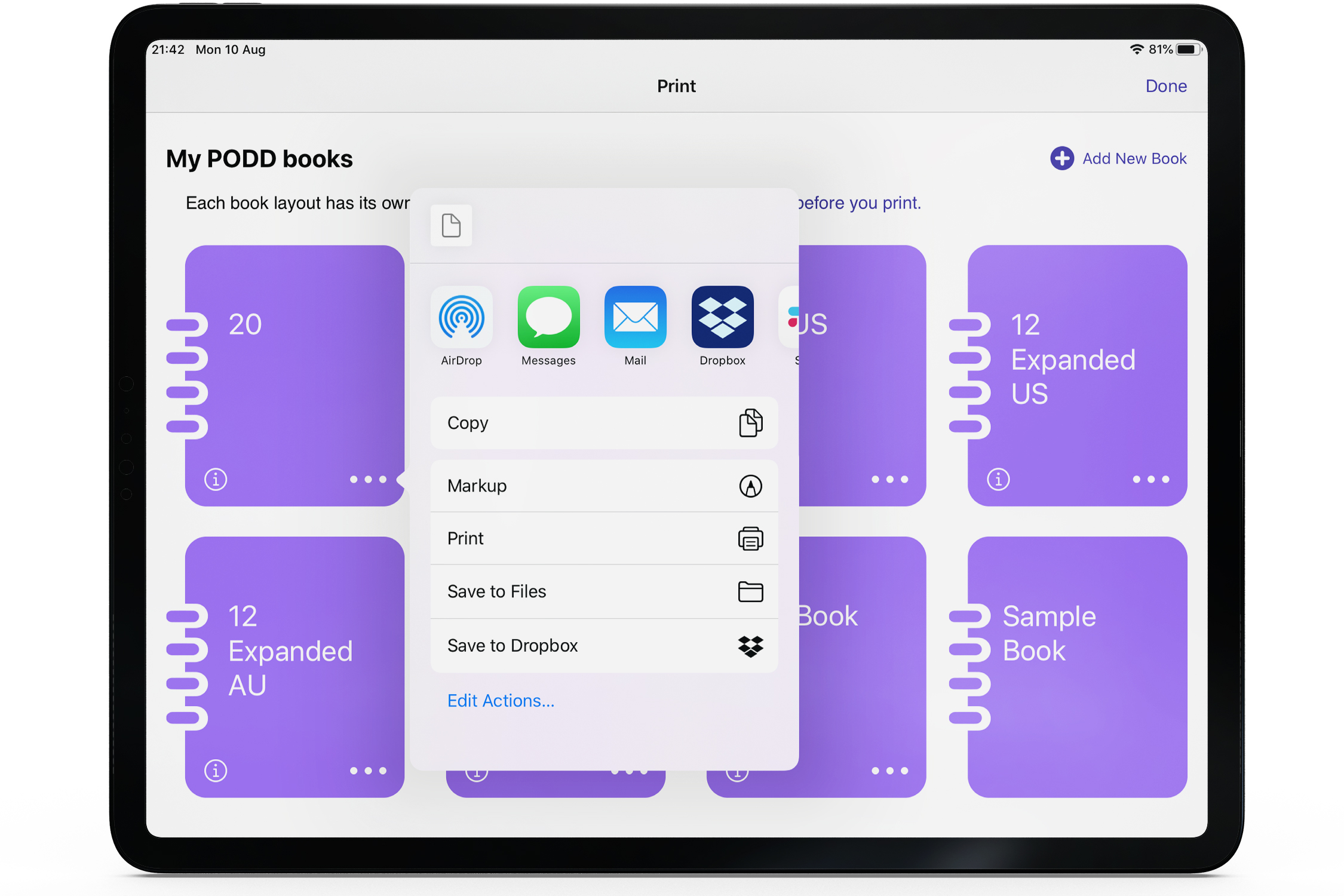
At AssistiveWare, we design communication apps for those with speaking disabilities. simPODD is a text-to-speech application based on the popular PODD vocabulary created by Gayle Porter. It is the only iPad app for PODD which combines both the digital page sets and a printing interface in one app.
Role : UX/UI, Prototyping, Design System, accessibility
Tools : Sketch, Photoshop, Illustrator
Role : UX/UI, Prototyping, Design System, accessibility
Tools : Sketch, Photoshop, Illustrator
What is PODD?
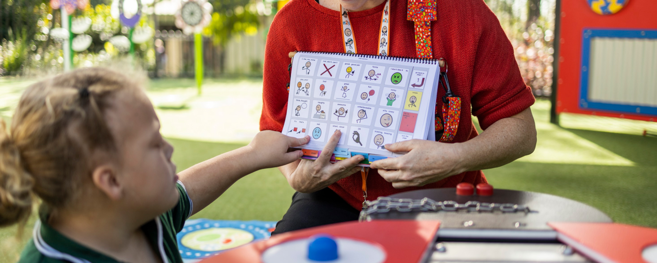
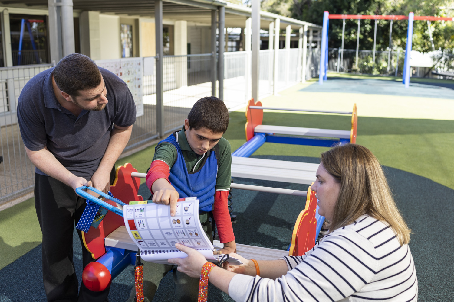
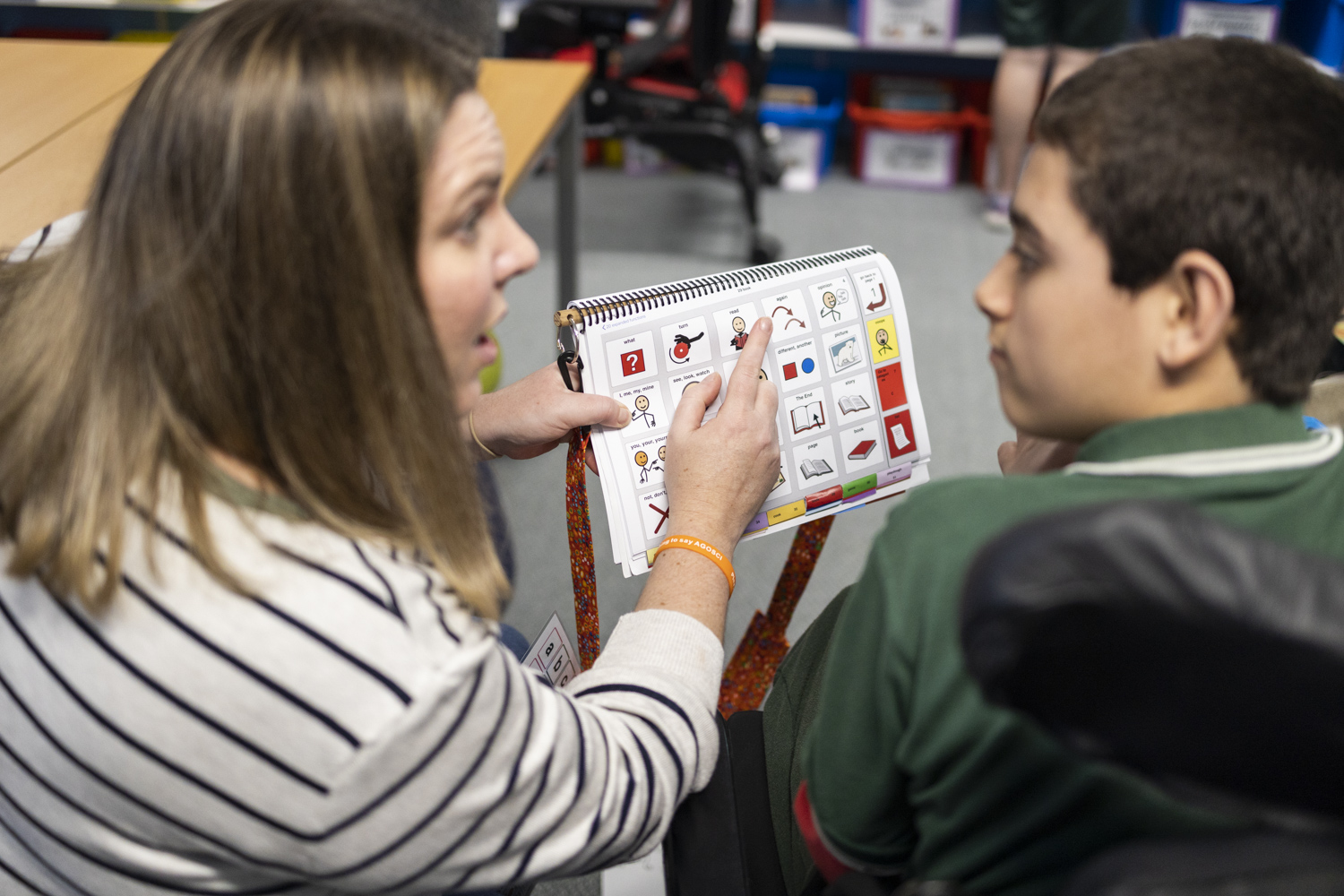
PODD is a popular vocabulary system which contains all the words in the English language system, organised in a specific way to enable easy communication for those with speech impairments. PODD started off as a communication system devised for those with Cerebral Palsy, a condition in which a person loses their physical and motor skills but can be cognitively sharp. The PODD books were originally designed as spiral bound books containing words and symbols laid out in a way that you start from page one and are directed through the book to be able to create sentences.
The user -
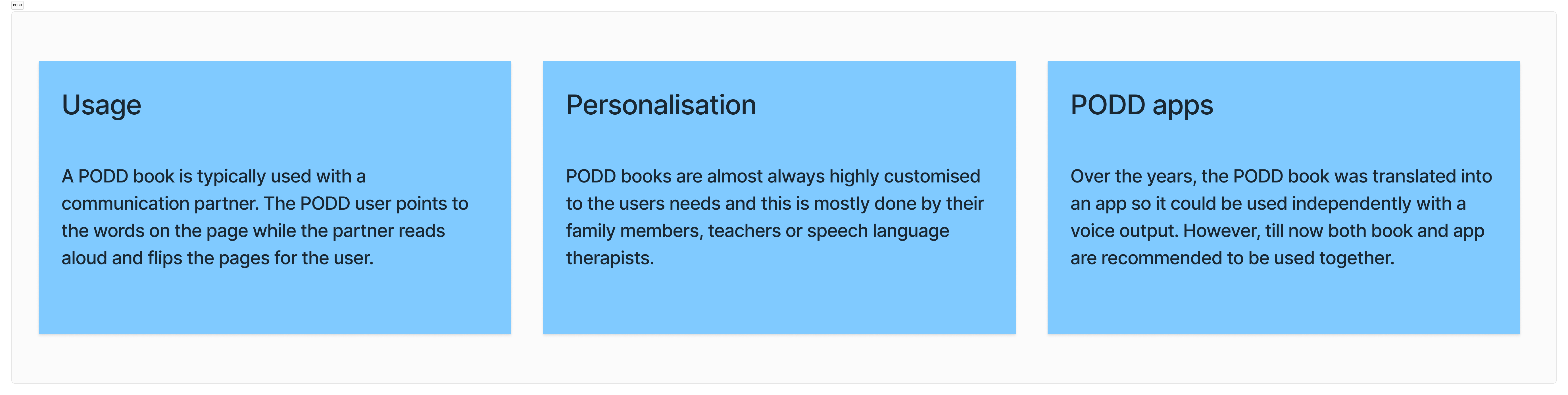
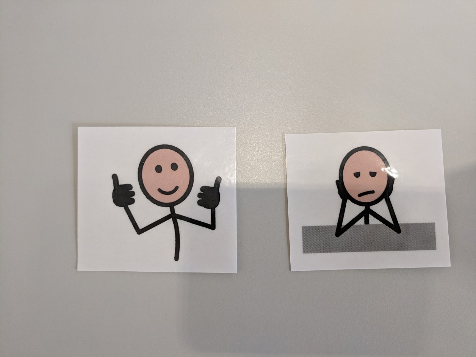
There are more than thousands of families that use PODD. PODD could be considered for anyone who would benefit from using tools to support communicating with others, and they can be personalised and adjusted to suit a person of any age. The aim of a PODD is to provide vocabulary for use in multiple environments, with a range of messages, across a range of topics. Selection of words and symbols in the PODD can be made by pointing, looking or other combinations of methods. Parents often learn about PODD with a big printed book with laminated pages. The question is how a child with severe impairments could ever learn to carry it, much less use it.
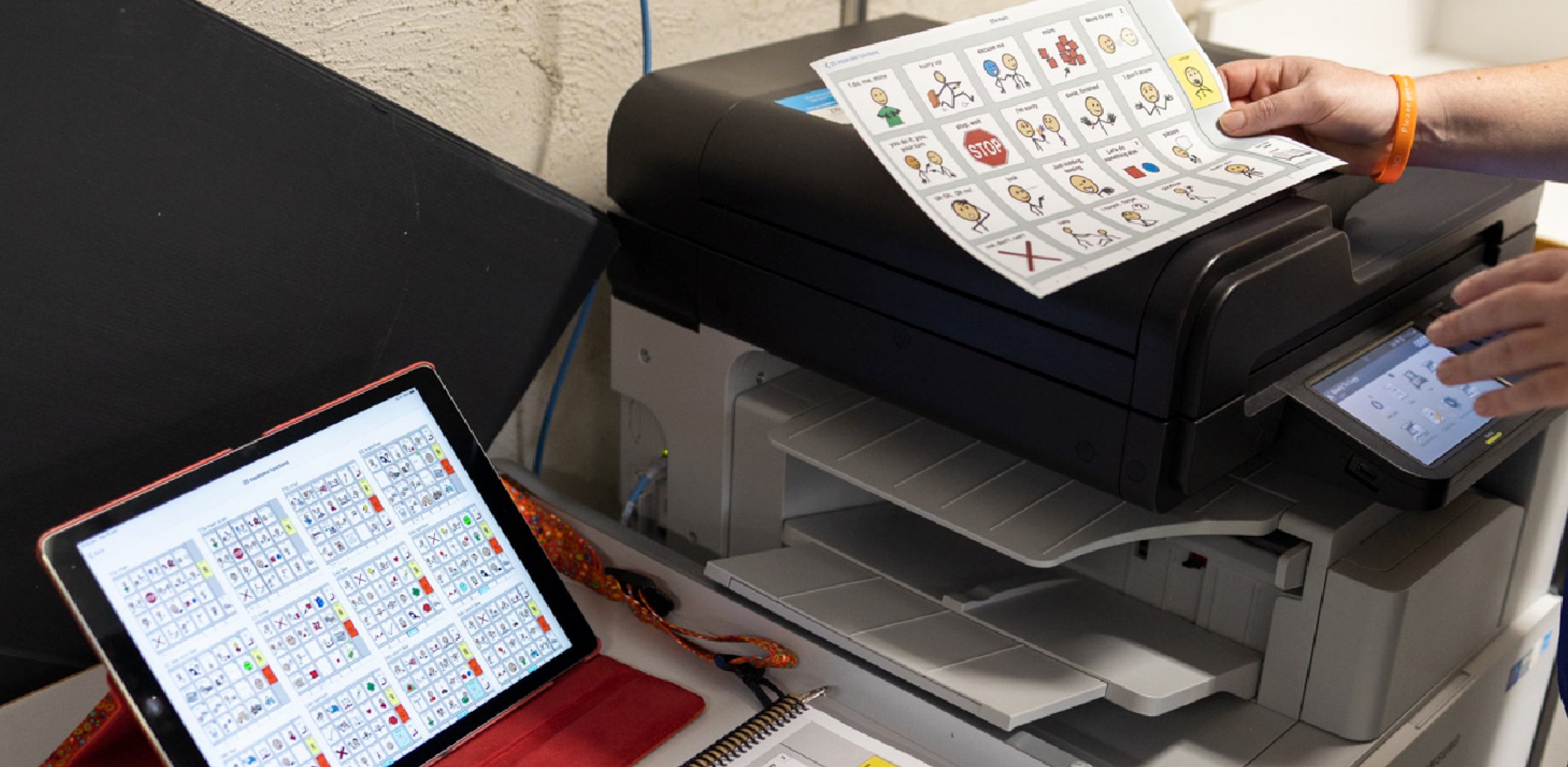
Image credits - AssistiveWare
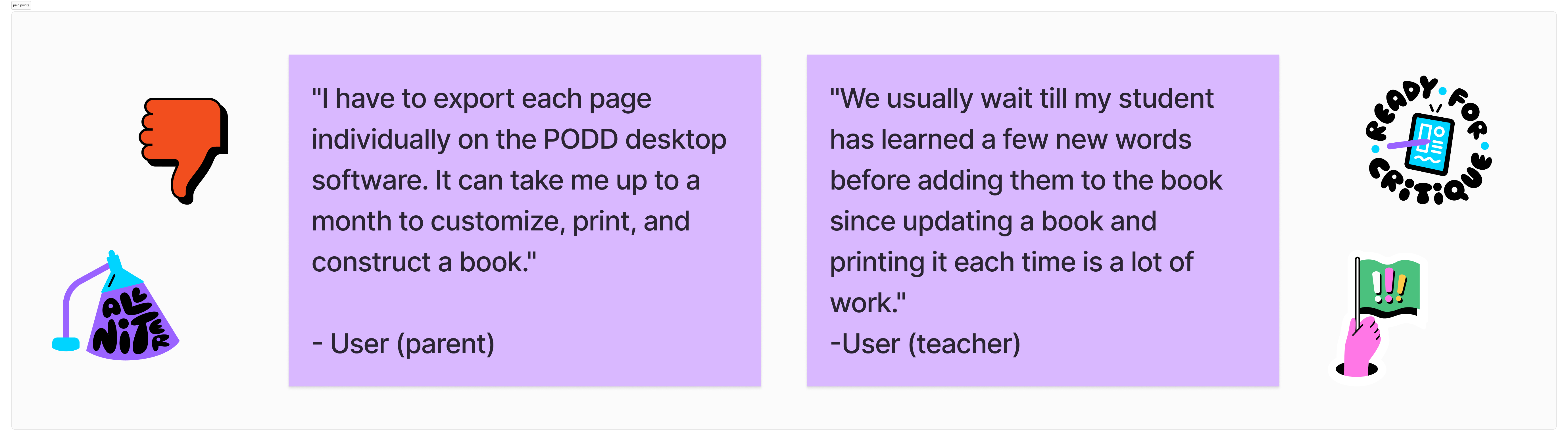
Using the existing PODD book, printing software was tedious. Users required reading heaps of documentation to understand how to set up, export, and construct their book. They found vocabulary editing in the existing solution difficult and, as a result, didn't update their child or student's books often enough.
Creating simPODD -
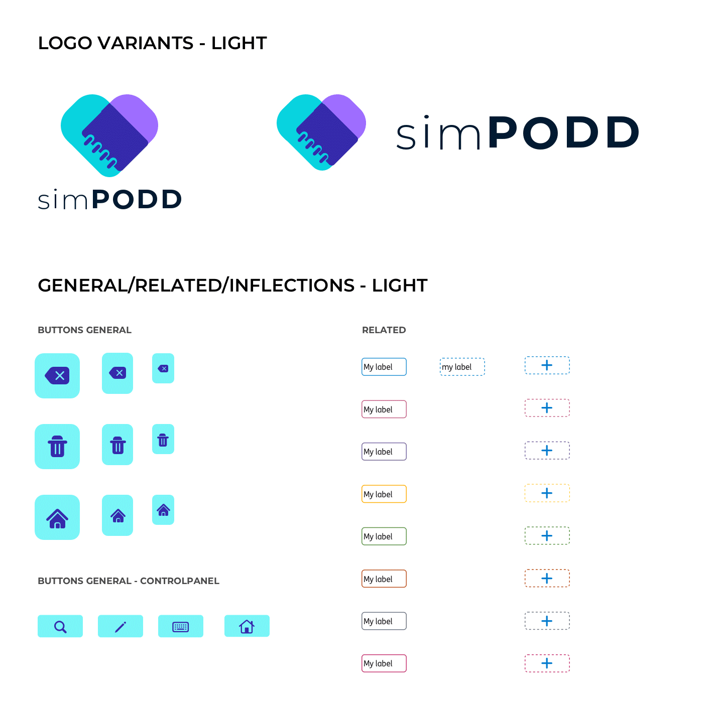
simPODD is an app that aims to combine the digital and the print world. This was the inspiration behind the logo design, to create a symbol that brings the two important features together. While choosing brand colors it was important to ensure compliance to AA standard contrast ratios.
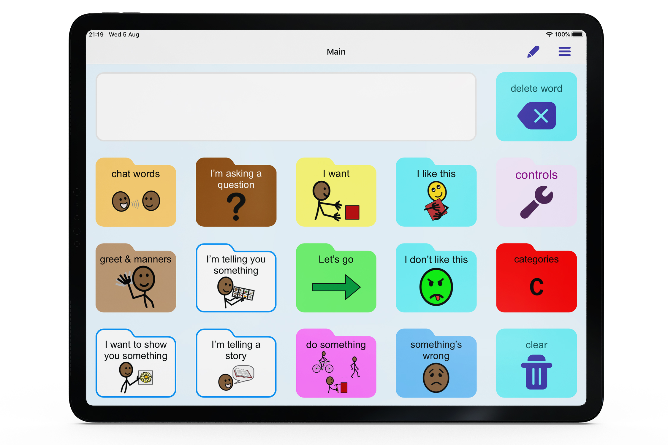
The application uses Symbolstix which is a library of dynamic symbols used for communication. They depict activities and people through stick figures. Using a symbol on a button makes it a vocabulary button. The function buttons like controls or delete word were designed to suit the tone of the app while being distinguishable from the vocabulary buttons.
 An app designed specifically for
  only AAC app with printing interface
 A range of dialects and voices available
Onboarding and interface -
When you start the app, you choose a subscription that suits you, and then go on to setting up your user. We have localised vocabulary with an astounding set of voices to choose from. Choosing between page-sets is very easy and optimised for various levels. The AssistiveWare website has plenty of supporting material to help users make an informed decision. The onboarding and set up follow Apple’s Interface Guidelines and reduce cognitive load to ensure a smooth set-up.
simPODD lets you be you. Choose from 40 voices, from friendly adult voices to genuine children’s voices with Australian, American, British and more regional accents. The voices are created using real recorded speech, so they sound surprisingly natural. All of the PODD digital page sets include: 15 Preschool, 15+ Preschool, 15 School, 15+ School, 60 Complex Syntax, 60 Expanded Key Word. Personalizing the app, editing and managing your books and page sets is smoother and saves you time and effort and makes it easier to just start communicating!
Creating a design system that is inclusive and forward thinking
We developed a design system following Atomic Design method that would serve as a comprehensive set of guidelines, components, and assets to maintain consistency, improve efficiency, and enhance the overall quality of design and development processes. It has reusable components, templates and accessibility guidelines. Design systems built with accessibility in mind are more adaptable to future technologies and changes. As technology evolves, accessible design practices provide a foundation for seamless integration of new features and ensure the continued usability of the application.
Testing and Learning -
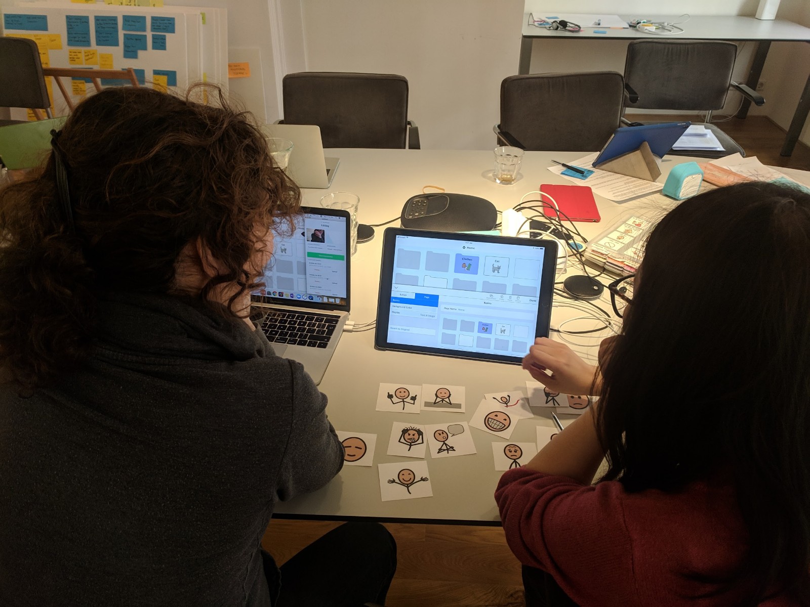
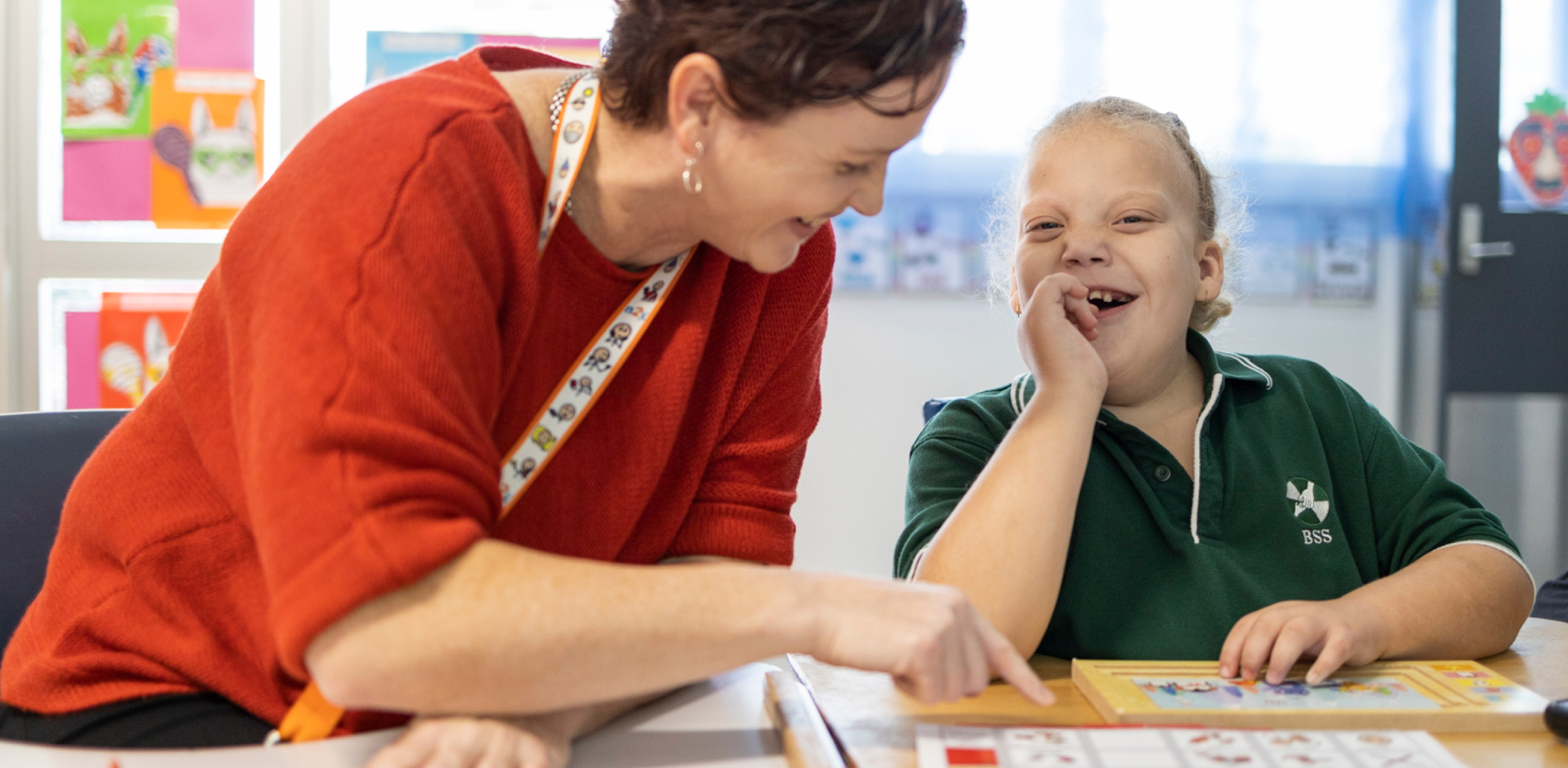
Testing was a key part of the process. The designs went through multiple iterations before they were ready to ship. Testing was done sometimes remotely with our users abroad and sometimes in our Amsterdam office. The participants were asked to pick a few of the language symbol cut outs to express their feelings after using the prototype. Something I learned doing this was how different parts of the company come together to make a product. Each team is crucial, be it support or marketing. This emphasized the importance of bringing different teams and stakeholders to work towards a common goal right at the beginning of a project.
What I’ve learnt from this
AAC empowers individuals with communication impairments to express their thoughts, needs, and desires effectively. Advocating for AAC ensures that these individuals have a voice and can actively participate in various aspects of life, including education, employment, and social interactions.
Advocating for AAC helps raise awareness and promote understanding of communication disabilities and the importance of inclusive communication practices. This reduces stigma and discrimination, fostering a more inclusive and supportive society for individuals with disabilities. It is essential for promoting empowerment, inclusion, equality, quality of life, education, research and development, policy change, and awareness. It plays a vital role in ensuring that individuals with communication impairments have the opportunity to fully participate and thrive in society.


This was my first experiencing working on a communication app in the AAC field. It made me learn how important designing for accessibility is. A significant percentage of users in the world have some partial visual impairments and considering them while designing opened a lot of opportunities.
The other highlight was attempting to design an application that gives those with communication problems a chance to express themselves. Feedback from the users was extremely overwhelming and I felt proud to be a part of the team and this journey. This is an application I will always cherish working on.