Proloquo Coach - guidance application for the AAC world
Getting started with Augmentative and Alternative Communication (AAC) can be overwhelming. Proloquo Coach is an app that provides step-by-step guidance and the support you need, to make communication with AAC a part of your everyday life.
Role : UX/UI, accessibility, design system
Tools : Sketch, Miro, Photoshop, Illustrator
Role : UX/UI, accessibility, design system
Tools : Sketch, Miro, Photoshop, Illustrator
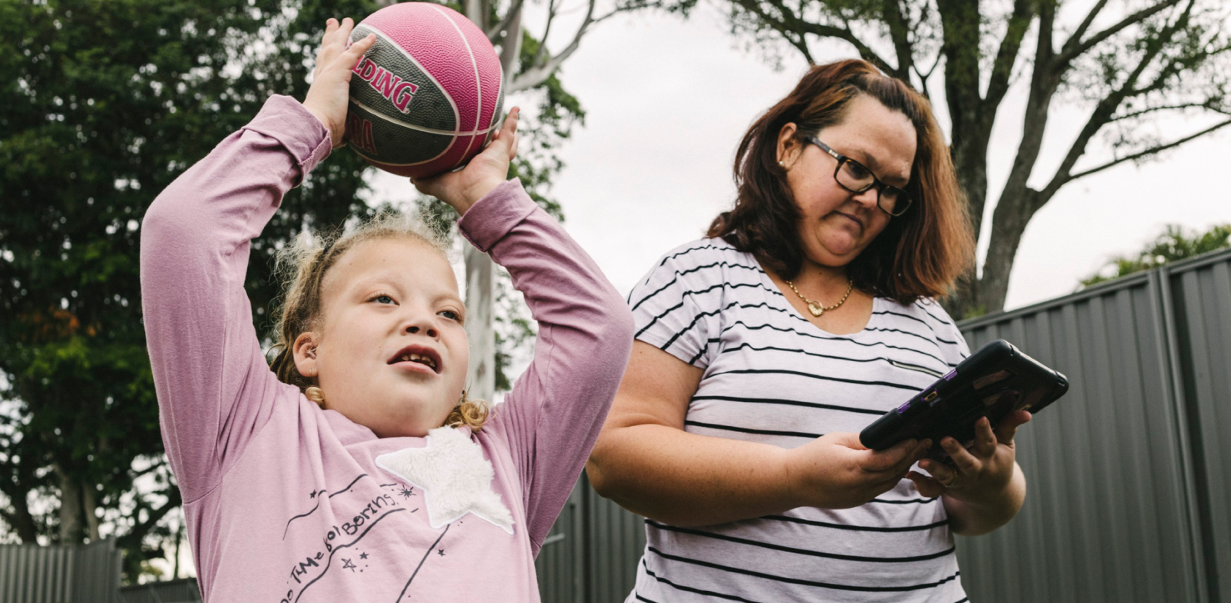
Image credits - AssistiveWare
Overview -
Proloquo Coach is an AAC guidance app for those parents or partners especially beginning their AAC journey. This application comes when you download the Proloquo app, by AssistiveWare. It uses learning and practice chapters to teach parents how to use AAC to communicate and connect with their child. We go with you along your journey and provide innumerous articles and live chat every step of the way!
Every application by AssistiveWare identifies with a character or an animal. The character represents the app’s story. For Proloquo Coach, we went with a fennec fox, whose role in this case is to guide the users along their AAC journey.
Every application by AssistiveWare identifies with a character or an animal. The character represents the app’s story. For Proloquo Coach, we went with a fennec fox, whose role in this case is to guide the users along their AAC journey.
The AAC Journey
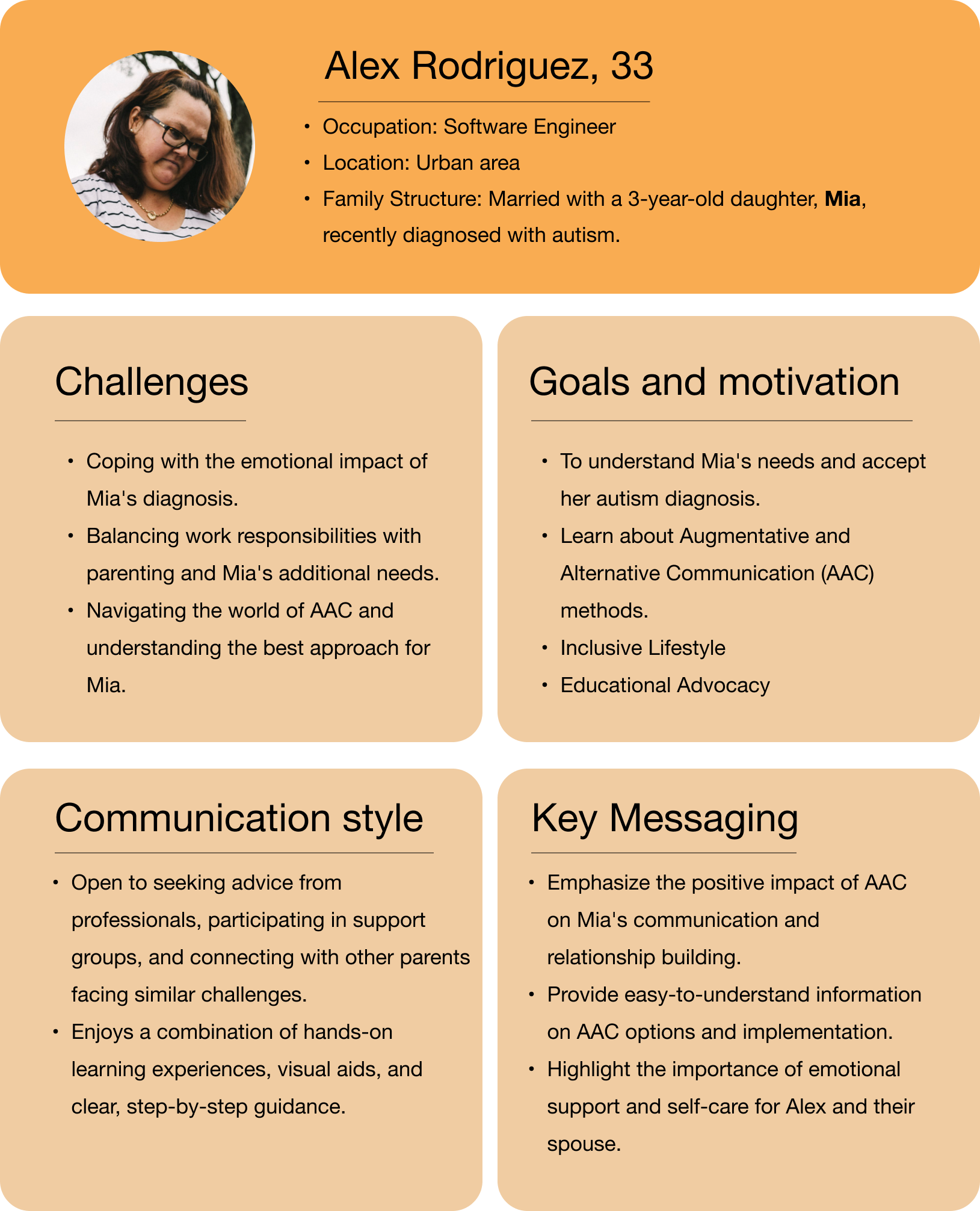
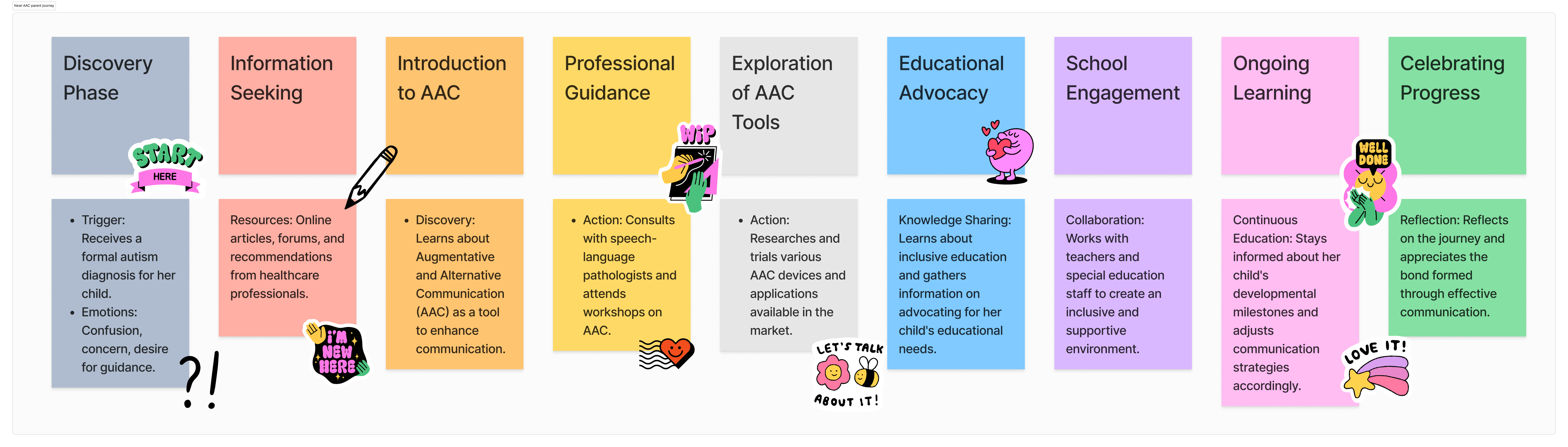
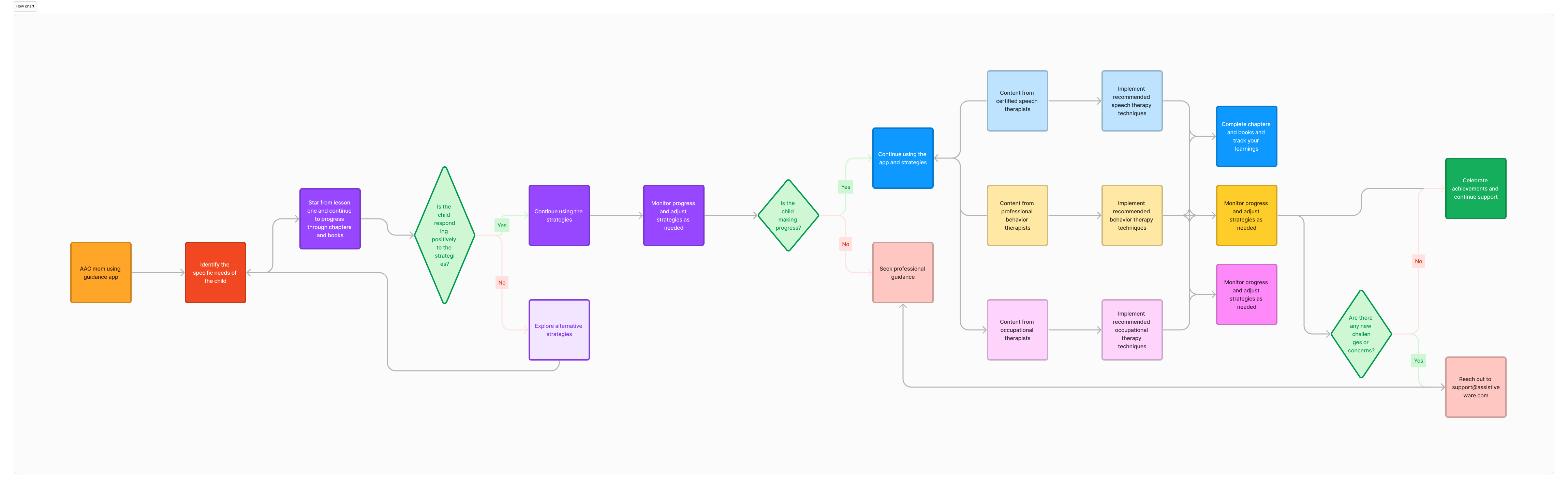
To map out the journey in more detail we developed a detailed user persona to identify how stakeholders involved in the AAC journey, including healthcare professionals, educators, and caregivers can contribute insights into the emotional and practical aspects of the user's experience. This fosters designing with empathy and a more comprehensive understanding of our user. By understanding the unique needs and motivations of the user persona created - ‘Alex’, a new AAC parent, support services and resources can be tailored to assist them in providing the best possible support for “Mia's” communication and overall development.
![]()
![]()
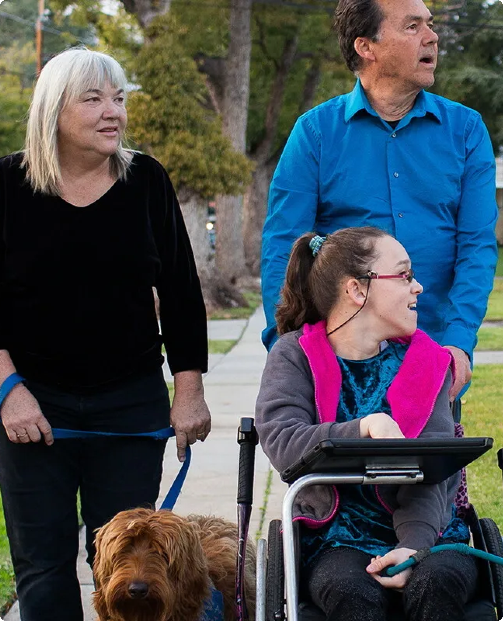
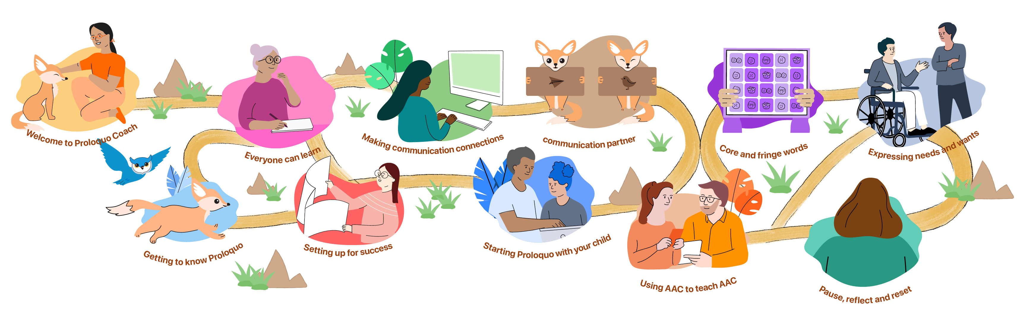
With Proloquo Coach we tried to let people learn new things in their AAC journey, let them practice and very importantly, let them share with the AAC team around their child. By “walking” the AAC journey with Proloquo Coach they focus on making the communication connection with their child. It's all about communicating in all forms and ways, so not only using the words of AAC.
Designed to guide and support -
Understanding the user journey allowed us to create wireframes that prioritize the user's needs, preferences, and pain points. User interviews helped consider the user's mindset, expectations, and motivations at different stages, which lead to more informed design decisions.
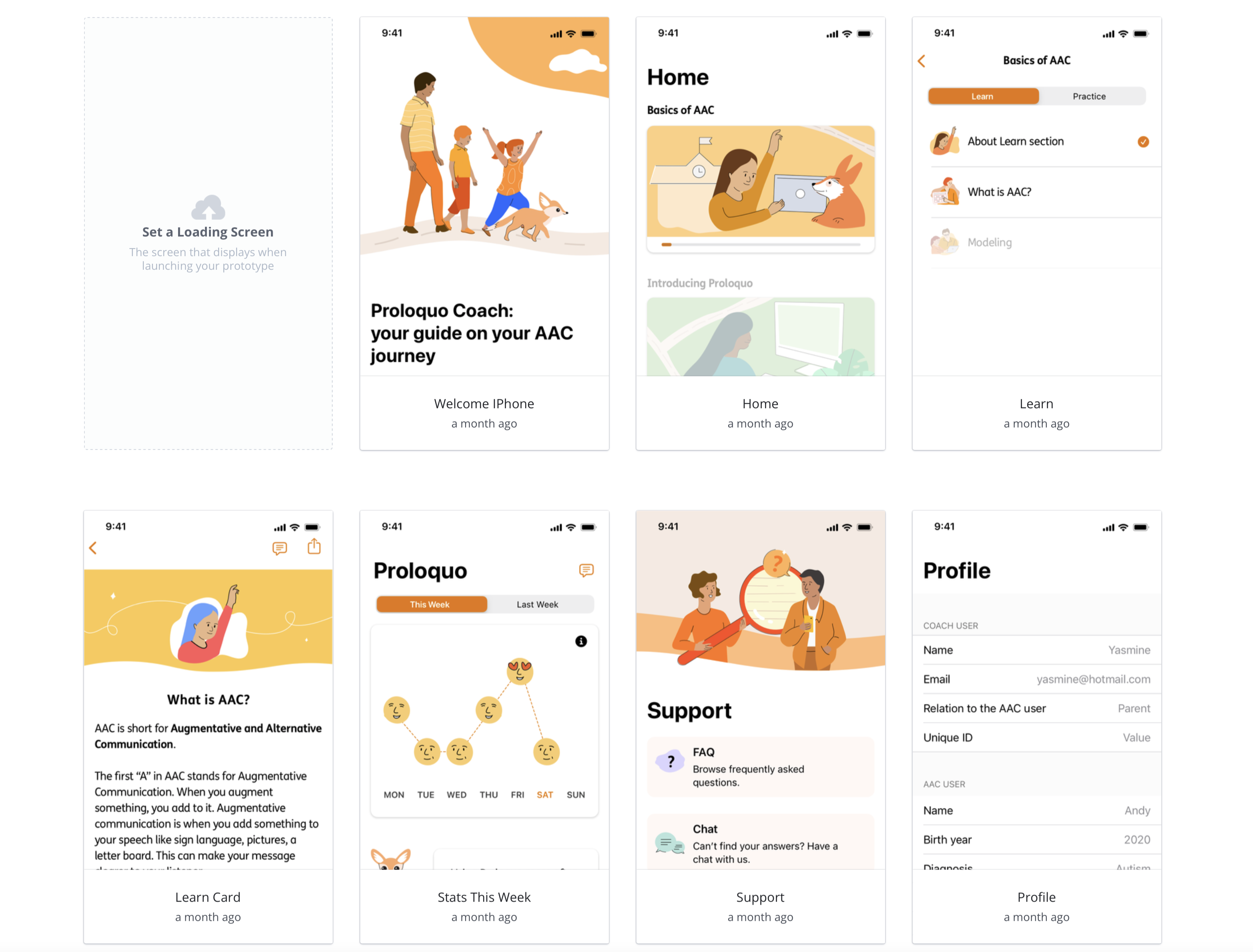

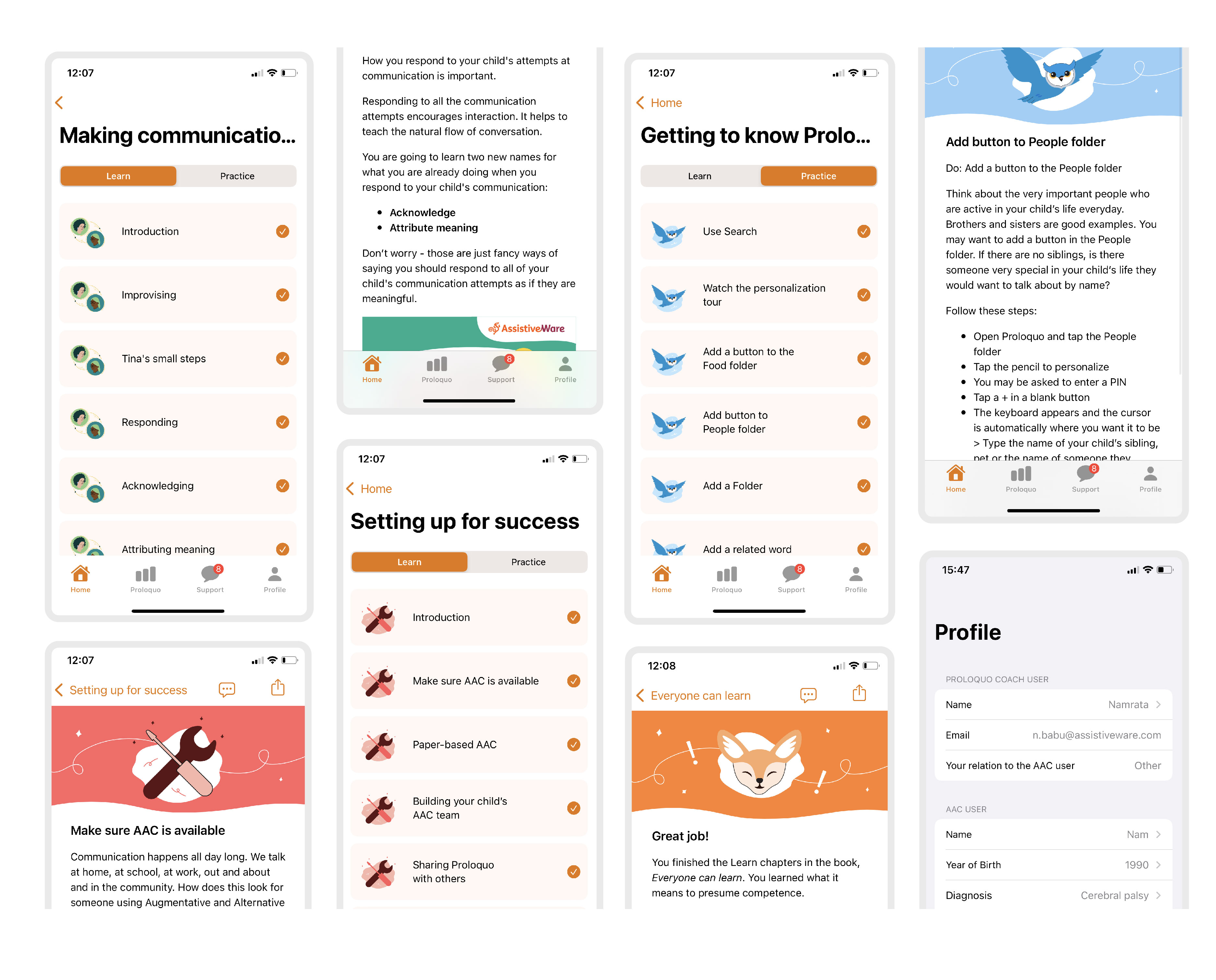
To organize the content, we divided them into two sections: Learn & Practice. We went through a series of exploration and user testing to identify optimal solutions to divide the content. It is important to keep in mind that the flow is intuitive to the user. Having iconography to provide visual aid to the content keeps it interactive and user friendly. To make sure they won't forget and stay motivated we send our users reminders and notifications. And at the end of the Learn chapters in each book we challenge their own knowledge with a quiz. We designed the interface in accordance with Apple’s Human interface guidelines. We also designed for dark mode and made sure to check for accessibility.
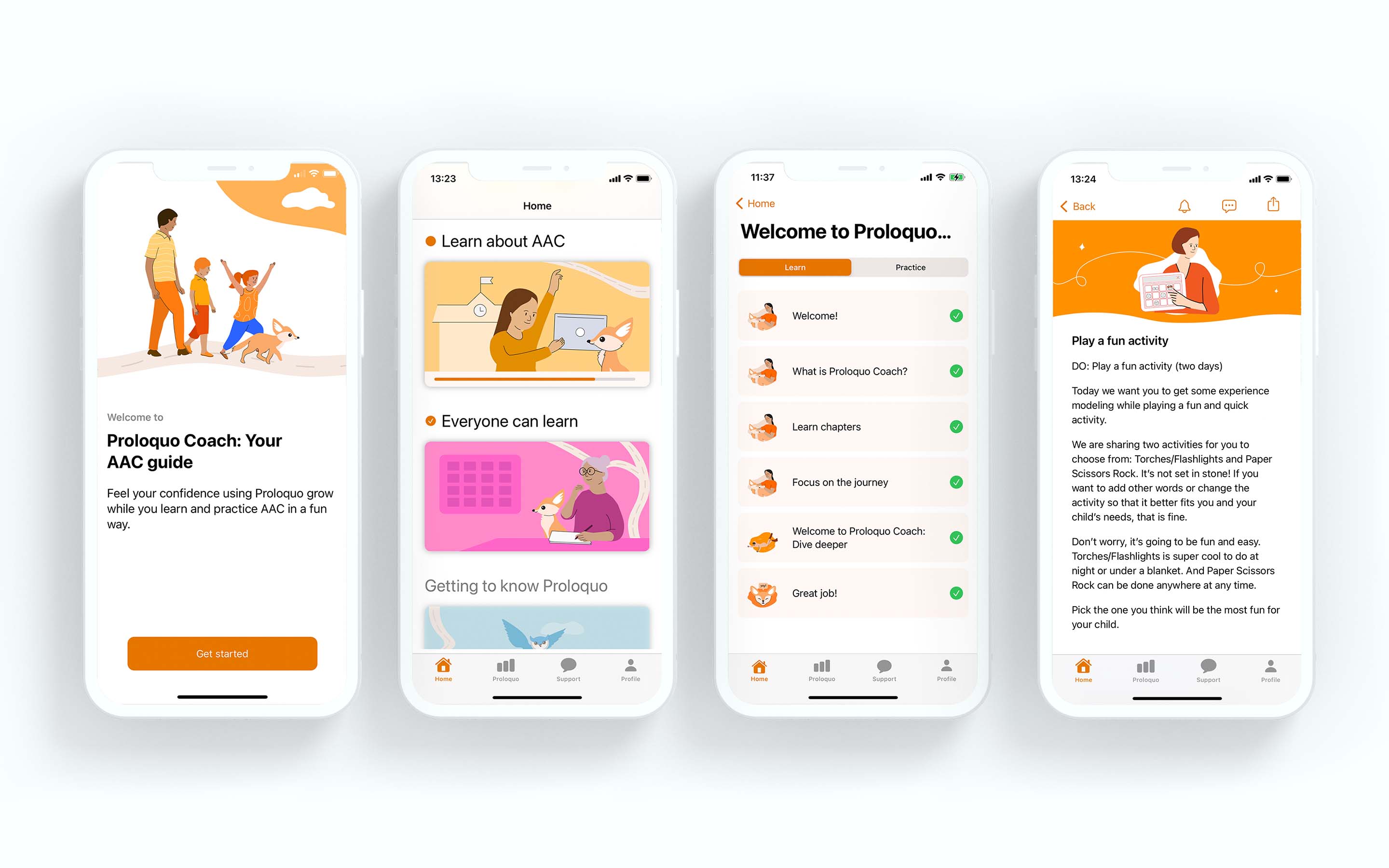
Learn Section : We organized content into chapters or topics, making it easy for parents to find relevant information. It includes multimedia elements like videos, articles, and quizzes to make learning engaging. There is a progress tracker to show users how far they've progressed in each chapter.
Practice Section : The interface offers interactive activities and scenarios for parents to practice what they've learned in the "Learn" section. We included scenarios that mimic real-life parenting situations. It also provides feedback and tips to help parents improve their skills.


Illustrations are a key element of the brand system
I developed an illustration library for a consistent visual style which is crucial for brand identity and user experience. This illustration library ensures that all graphical elements used in Proloquo and Proloquo Coach applications adhere to the same design principles, color palettes, and overall aesthetic, resulting in a cohesive and recognizable brand. They range from detailed hero images down to spot images with a consistent narrative of practicality, optimism, and friendliness used throughout. This is accomplished through shape, color, softness, and curves to achieve an inviting, engaging experience.

These illustrations
︎︎︎ make complex ideas more accessible
︎︎︎ represent our brand - personality, voice, and platform - in an efficient and clear way
︎︎︎ scale up or down depending on the context
︎︎︎ affect tone and speak directly to users depending on the job to be done and the user's emotional state
︎︎︎ help to tell stories and thoughtfully convey ideas - not be used as decoration or without consideration

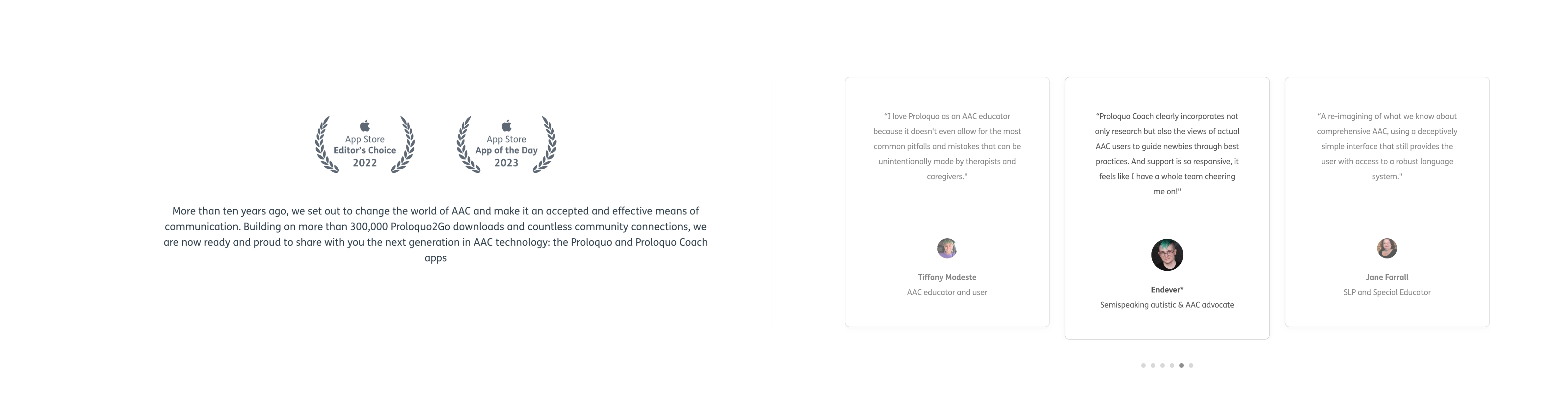
What others say and love about Proloquo Coach -